`,
);
return config;
});
return config;
};
```
### Calling a method in AppDelegate.m using expo inside didFinishLaunchingWithOptions method [#calling-a-method-in-appdelegatem-using-expo-inside-didfinishlaunchingwithoptions-method]
Inside your app.plugin.js file, add the following code.
```js
const { withAppDelegate } = require('expo/config-plugins');
module.exports = function myCustomExpoFunctionName(config) {
config = withAppDelegate(config, (config) => {
const didFinishLaunchingWithOptionsLine = '[FIRApp configure];';
config.modResults.contents = config.modResults.contents.replace(
didFinishLaunchingWithOptionsLine,
`${didFinishLaunchingWithOptionsLine}
// Add your method call here Ex: [self logAppLaunch];
`,
);
return config;
});
return config;
};
```
### Adding a new method in AppDelegate.m using expo [#adding-a-new-method-in-appdelegatem-using-expo]
Inside your app.plugin.js file, add the following code.
```js
const { withAppDelegate } = require('expo/config-plugins');
module.exports = function myCustomExpoFunctionName(config) {
config = withAppDelegate(config, (config) => {
const newMethod = `
// Add your new method here
- (void)logAppLaunch {
NSLog(@"The app has launched successfully.");
}
`;
config.modResults.contents = config.modResults.contents.replace(
'@end',
`${newMethod}
@end`,
);
return config;
});
return config;
};
```
# Adding iOS Permissions with Expo Config Plugins (/docs/native-code/config-plugins/adding-ios-permissions)
## Introduction [#introduction]
This guide explains how to add various iOS permissions to your Expo project using Config Plugins. By following these instructions, you can customize your app's Info.plist file to request necessary permissions from users.
## Initial Setup [#initial-setup]
You could follow the steps provided in the [Bare App Config](/docs/native-code/config-plugins/bare-app-config) for a comprehensive guide to set up your project with Expo Config Plugins as the below steps only cover a small part of the process.
Within your theme, create a new file named `app.plugin.js` at its root with the following structure:
```js
const { withInfoPlist } = require('@expo/config-plugins');
const withIosPermissions = (config) => {
return withInfoPlist(config, (config) => {
// Permission keys will be added here
return config;
});
};
module.exports = withIosPermissions;
```
## Common iOS Permissions [#common-ios-permissions]
Here are some common iOS permissions and their corresponding `Info.plist` keys:
- Photo Library: `NSPhotoLibraryUsageDescription`
- Camera: `NSCameraUsageDescription`
- Microphone: `NSMicrophoneUsageDescription`
- Location (When In Use): `NSLocationWhenInUseUsageDescription`
- Location (Always): `NSLocationAlwaysUsageDescription`
- Contacts: `NSContactsUsageDescription`
- Calendar: `NSCalendarsUsageDescription`
- Reminders: `NSRemindersUsageDescription`
- Motion & Fitness: `NSMotionUsageDescription`
## Using the Config Plugin [#using-the-config-plugin]
To add permissions, modify the `withIosPermissions` function. For example, to add Photo Library and Camera permissions:
```js
const withIosPermissions = (config) => {
return withInfoPlist(config, (config) => {
config.modResults.NSPhotoLibraryUsageDescription =
'We need access to your photos to let you choose profile pictures and share images.';
config.modResults.NSCameraUsageDescription =
'Camera access is required to take photos for your profile and to scan QR codes.';
return config;
});
};
```
You could add multiple permissions by adding more keys to the `config.modResults` object.
## Applying the Config Plugin [#applying-the-config-plugin]
To use the Config Plugin in your app, add the following to your package.json:
```json
{
"expo_plugins": [
"@appmaker-packages/your-theme-package-name/app.plugin.js"
]
}
```
This will add all the specified permissions to your Info.plist when you build your app.
Remember to only include permissions that your app actually needs, as unnecessary permission requests can lead to rejection during the App Store review process.
# How to add code to native using expo-bare-react-native-app (/docs/native-code/config-plugins/bare-app-config)
This repository can be used to test builds and confirm that app configurations are functioning as expected.
## Get Started [#get-started]
1. Clone the `expo-bare-react-native-app` repository
2. Install all dependencies using `yarn install`
3. Add your plugin to `packages/plugins` directory
4. Create an `app.plugin.js` file at the root of your plugin with the following content:
```js
module.exports = function customExportFunction(config) {
return config;
};
```
4. Update the `expo_plugins` array in `appmaker.package.plugin.json` to include the path to your plugin's `app.plugin.js` file:
```json
{
"expo_plugins": [
"@appmaker-xyz/plugins/my-plugin-1/app.plugin.js",
"@appmaker-xyz/plugins/my-plugin-2/app.plugin.js",
"@appmaker-xyz/plugins/my-plugin-2/app.plugin.js",
]
}
```
5. Run `expo prebuild` to generate platform files with your custom configuration
After completing these steps, you should be able to see your custom configuration within the generated platform files.
## Configuring platform files [#configuring-platform-files]
Under the hood, this is using `expo-config-plugins` to generate the paltform files. You can learn more about it [here](https://docs.expo.dev/config-plugins/introduction/)
### For Android (`build.gradle`) [#for-android-buildgradle]
To add a new implementation in the `build.gradle` file, you can modify your `app.plugin.js` file as follows:
```js
const { withAppBuildGradle } = require('@expo/config-plugins');
const PATH_TO_ADD = `implementation("com.facebook.react:react-android")`;
const withCustomAppBuildGradleImplementation = (
config,
{ implementationPackage },
) => {
return withAppBuildGradle(config, (config) => {
if (config.modResults.contents.includes(implementationPackage)) {
return config;
}
config.modResults.contents = config.modResults.contents.replace(
PATH_TO_ADD,
`${PATH_TO_ADD}
${implementationPackage}`,
);
return config;
});
};
module.exports = function withCustom(config) {
config = withCustomAppBuildGradleImplementation(config, {
implementationPackage: 'implementation("com.custom:app-android-sdk:12.5.06")',
});
return config;
};
```
#### How it works [#how-it-works]
- The code first checks if the specified implementation is already present in the `build.gradle` file.
- If the implementation is not found, it adds the new implementation to the file.
- It uses the `withAppBuildGradle` method to modify the `build.gradle` file.
- Inside the `withAppBuildGradle` method, it locates the string `implementation("com.facebook.react:react-android")` and adds the new implementation directly below it.
This approach ensures that your custom implementation is added to the `build.gradle` file without duplicating existing entries, and places it in a specific location within the file.
### For iOS (`Info.plist`) [#for-ios-infoplist]
To add new entries in the `Info.plist` file, you can modify your `app.plugin.js` file as follows:
```js
const { withInfoPlist } = require('expo/config-plugins');
module.exports = function myCustomExpoFunctionName(config) {
config = withInfoPlist(config, (config) => {
// Type 1: Adding a String
config.modResults['YourCustomMessageKey'] = 'Your custom message';
// Type 2: Adding a Dictionary
config.modResults.MyCustomDictionary = {
MY_FIRST_KEY: 'My first value',
MY_SECOND_KEY: 'My second value'
};
// Type 3: Adding an Array
config.modResults.MyCustomArray = ['My first value', 'My second value'];
return config;
});
return config;
};
```
#### How it works [#how-it-works-1]
- The code uses the `withInfoPlist` method from Expo's config plugins to modify the `Info.plist` file.
- It demonstrates three types of modifications: adding a string, a dictionary, and an array.
- For each type, it directly modifies the `config.modResults` object, which represents the contents of the `Info.plist` file.
- The changes are applied without checking for existing entries, so be cautious to avoid overwriting important existing configurations.
### Modifying `MainApplication.java` and `AppDelegate.m` [#modifying-mainapplicationjava-and-appdelegatem]
You can find the guides for injecting code into [`AppDelegate.m`](/docs/native-code/config-plugins/adding-codes-in-appdelegate-m-file) and [`MainApplication.java`](/docs/native-code/config-plugins/add-codes-in-main-application-android-file).
# Config plugins (/docs/native-code/config-plugins)
# How to modify build.gradle file (/docs/native-code/config-plugins/modify-build-gradle)
in your `app.plugin.js` file, you can write below to add new implementation in `build.gradle` file.
```js
const { withAppBuildGradle } = require('@expo/config-plugins');
const PATH_TO_ADD = `implementation("com.facebook.react:react-android")`;
const withCustomAppBuildGradleImplementation = (
config,
{ implementationPackage },
) => {
return withAppBuildGradle(config, (config) => {
if (config.modResults.contents.includes(implementationPackage)) {
return config;
}
config.modResults.contents = config.modResults.contents.replace(
PATH_TO_ADD,
`${PATH_TO_ADD}
${implementationPackage}`,
);
return config;
});
};
module.exports = function withCustom(config) {
config = withCustomAppBuildGradleImplementation(config, {
implementationPackage: 'implementation("com.custom:app-android-sdk:12.5.06")',
});
return config;
};
```
In the above code, we are adding a new implementation in the `build.gradle` file. How it works is, it first checks if the implementation is already added in the file. If it is not added, then it adds the implementation in the file. using the `withAppBuildGradle` method.
inside `withAppBuildGradle` method, we are finding the the string `implementation("com.facebook.react:react-android")` and adding the new implementation below it.
# Sample expo plugin file for iOS and native changes (/docs/native-code/config-plugins/sample-expo-plugin-file)
So for best practice, you can create a new file named `app.plugin.js` in the root of your project and add the following code. Also as a best practice, you can add your custom codes in separate functions for iOS and Android and if you can keep these functions in separate files and import them in `app.plugin.js` file for better code management.
## app.plugin.js [#apppluginjs]
```js
const { withAppDelegate, withInfoPlist, withAppBuildGradle } = require('expo/config-plugins');
const applyIOS = (config) => {
config = withAppDelegate(config, (config) => {
// Add your custom codes here
return config;
});
config = withInfoPlist(config, (config) => {
// Add your custom code here
return config;
});
return config;
};
const applyAndroid = (config) => {
config = withAppBuildGradle(config, (config) => {
// Add your custom code here
return config;
});
return config;
};
module.exports = function myCustomExpoFunctionName(config) {
config = applyIOS(config);
config = applyAndroid(config);
return config;
};
```
## Best practices [#best-practices]
1. Do not put console.log in the plugin file when you are building the app for production. It might fail the build process. But you can use console.log for debugging purposes.
2. Keeping android and iOS codes in separate functions and separate files for better code management.
`app.plugin.js`
```js
const { applyIos } = require('./buildConfig/ios');
const { applyAndroid } = require('./buildConfig/android');
module.exports = function myCustomExpoFunctionName(config) {
config = applyIOS(config);
config = applyAndroid(config);
return config;
};
```
`buildConfig/ios.js`
```js
const { withAppDelegate, withInfoPlist } = require('expo/config-plugins');
module.exports.applyIos = function applyIos(config) {
config = withAppDelegate(config, (config) => {
// Add your custom codes here
return config;
});
config = withInfoPlist(config, (config) => {
// Add your custom code here
return config;
});
return config;
};
```
`buildConfig/android.js`
```js
const { withAppBuildGradle } = require('expo/config-plugins');
module.exports.applyAndroid = function applyAndroid(config) {
config = withAppBuildGradle(config, (config) => {
// Add your custom code here
return config;
});
return config;
};
```
# How to add permissions on app (/docs/native-code/how-to-add-permissions-on-app)
## Introduction [#introduction]
In this guide, we will learn how to add permissions on the app. We will use the `app-permissions` plugin to add permissions on the app.
## How to add permissions on the app [#how-to-add-permissions-on-the-app]
Below is an example on adding permissions for location and camera on the app. It will request for the permissions when the app is opened since we are adding in root component.
Similarly, you can add the permissions code in any component where you want to request for the permissions. It can be added in the useEffect hook of the component.
You can add any number of permissions in the `permissions` array.
```jsx
import React, { useEffect } from "react";
import { PERMISSIONS , requestMultiple } from "react-native-permissions";
import { appPluginStoreApi } from "@appmaker-xyz/core";
import { Platform } from "react-native";
const checkPermission = async (permission, permissions) => {
if (permissions && permissions.length > 0) {
const permissionIndex = permissions.findIndex(
(p) => p.permission === permission
);
if (permissionIndex !== -1) {
return true;
}
}
return false;
}
const CustomComponent = () => {
useEffect(() => {
const permissions =
appPluginStoreApi()?.getState()?.plugins?.["app-permissions"]?.settings
?.permissions;
const platformPermissions = [];
// permissions = [{permission: "location"}, {permission: "camera"}]
if(checkPermission('camera', permissions)){
if (Platform.OS === "ios") {
platformPermissions.push(PERMISSIONS.IOS.LOCATION_WHEN_IN_USE);
} else {
platformPermissions.push(PERMISSIONS.ANDROID.ACCESS_FINE_LOCATION);
}
}
requestMultiple(platformPermissions)
.then((statuses) => {
console.log("permissions", statuses);
})
.catch((err) => {
console.log("permissions->error", err);
});
}, []);
return null;
};
addFilter("app-custom-root-components", "test-case", (currentComponents) => {
currentComponents?.push(CustomComponent);
return currentComponents;
});
// whole code should be placed outside activate function
function activate() {
console.log("Activated");
}
```
In the above code, we are adding the `CustomComponent` in the root component. We are checking if the permissions are added in the `app-permissions` plugin settings. If the permissions are added, we are requesting for the permissions.
# Native code (/docs/native-code)
# Instructions for adding libraries that contain native code (/docs/native-code/instructions-for-adding-libraries)
## Description [#description]
This guide will help you to add libraries that contain native code to your app.
## Steps [#steps]
1. Open the theme or extension's `package.json` file.
2. Add the native dependencies required inside the peer-dependencies section. Below is an example of how to add the `react-native-webview` library.
```json
{
"name": "@appmaker-packages/sample-theme",
"peerDependencies": {
"react-native-webview": "12.2.0"
}
}
```
Likewise, you can add other libraries as well.
3. Save the changes to the package.json file.
4. Run the command `appmaker release` to release your extension or theme.
5. Access the partner dashboard.
6. Navigate to the **App Builds** section.
7. Select the "debug" option for the build types. For more information on app builds section, refer to the [App Builds](/docs/partner-dashboard/app-build) guide.
8. Initiate the debug build process from the partner dashboard.
Please follow these steps to add the necessary native dependencies and perform the appmaker release, followed by a debug build from the partner dashboard.
# App build Trigger (/docs/partner-dashboard/app-build-trigger)
Once a build is created you can view the same on the build list with all the details that were entered while configuring.
## Configuration [#configuration]
To access the App build trigger section, navigate to `App builds` within the Appmaker dashboard (as shown in the screenshot below)
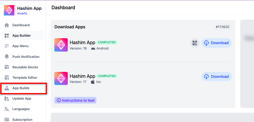
Once within the `App builds` tab, you can create new test builds by selecting the relevant options for your build. (Refer to screenshot 2)
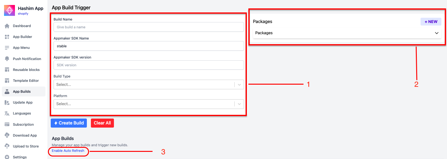
### **Section 1 ** [#section-1-]
**`Build name`** - Enter a name for your build under the “build name” input.
**`Appmaker SDK name`** - Enter the appmaker sdk name. for eg:stable.
**`Appmaker SDK version`** - Enter the appmaker sdk version.
**`Build type`** - For iOS, from the drop-down menu, select either preview or release or developement.
> (Note: For uploading the build to the test flight - please ensure to select “release”).
**`Platform`** - Select either `android`or `iOS` from the multi-select input.
### **Section 2** [#section-2]
`Packages` - Click on the “**`+New`**” button in the packages section. From the expanded window, Provide package name and version number
### **Section 3 ** [#section-3-]
* * *
Enable **Auto refresh** option to auto refresh the page
### **Create build**: [#create-build]
Click on “`Create build`” to create your test build.
{/*  */}
{/*  */}
## **Download Build** [#download-build]
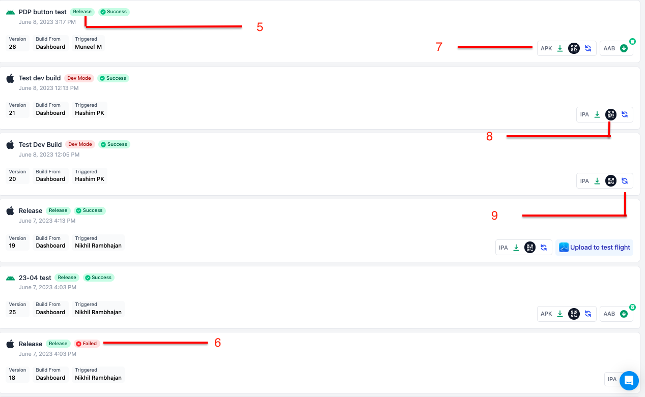
**Once a build is created you can view the same on the build list with all the details that were entered while configuring**.
5. **Build Type** - Build type shows the type of build selected during the configuration.
6. **Status** - Status shows the status of the build. There are 3 statuses that display the progress.
- `In Progress`
- `Failed `
- `Success`
7. **Download** - The green download icon allows you to download the .zip file or .apk file based on the platform that was selected.
8. **Download using the QR Code** - This option allows you to scan the QR code directly from your mobile phone.
9. **Refresh** - The refresh button allows you to refresh the build if the status remains the same.
# App Build (/docs/partner-dashboard/app-build)
## Configuration [#configuration]
### Step 1 - Navigate to the App Build page [#step-1---navigate-to-the-app-build-page]
To access the App Build page, navigate to the [Appmaker partner dashboard](https://partners.appmaker.xyz/). Once logged in, you will be taken to the homepage of the partner dashboard. Click on the "`App Build`" menu to access the App Build page.
If the project you want to take build for is not listed in the drop down of the `project` field, you can send a [**project access request**](/docs/partner-dashboard/request-project-access) to the merchant and once the merchant [**approves the request**](https://docs.appmaker.xyz/docs/MISC/project-permissions), you will be able to see the project in the drop down.
You can check the below example screenshot for reference:
Select the `IOS` platform while creating the build and also select the type of build as `Development`.
3. After the build is created, click on the `Download IPA` button to download the build.
4. After the build is downloaded, unzip the build and open the simulator.
# How to invite a team member to the Appmaker Partner Dashboard. (/docs/partner-dashboard/invite-member)
To prevent the creation of duplicate organizations and potential limitations on access to shared projects, we suggest that the admin initially signs up and then invites team members from the partner dashboard. This approach eliminates the need for each team member to sign up individually.
To understand the process of adding new team members to the partner dashboard, please follow the steps outlined below.
After the Admin successfully signs up and sets up their account on the Appmaker Partner dashboard, they can easily invite their team members to join the organization by following a straightforward process.
`Step 1` - From your partner dashboard, select the `invite members` as shown below. Click on the `create Organization invite` button.
Do reach out to your team mates to accept the invitation as soon as possible once you have shared the same from the partner dashboard.
# How to request project access (/docs/partner-dashboard/request-project-access)
## Overview [#overview]
If you want to request project access from the merchant on partner dashboard, you can do it by using the `Project Access Requests` tab. You can request access to a project by using the project id. The merchant will accept the request from the Appmaker dashboard. Then you will be able to access the project from the partner dashboard.
Refer to [**this**](https://docs.appmaker.xyz/docs/MISC/project-permissions) doc to know how merchants can accept project access requests.
## Steps [#steps]
1. Go to the `Project Access Requests` tab on the partner dashboard.
2. Click on `Create project access request` button.
3. Enter the project id .
4. Select your organization from the partner organization dropdown.
5. Click on `Create Project Access Request` button.
```json
const customAttributes = [
{
"key": "_appmaker",
"value": "true"
}
]
const variant = {
"id": "gid://shopify/ProductVariant/40026424869026",
"sku": "",
"image": {
"url": "https://cdn.shopify.com/s/files/1/0571/2193/1426/products/518s6Q_2BEqxL._AC_UX522_250x.jpg?v=1622444565"
},
"product": {
"id": "gid://shopify/Product/6796049809570",
"onlineStoreUrl": null,
"vendor": "Yasistores",
"handle": "fgdj",
"productType": "T shirts",
"tags": [],
"product_sku": null
},
"compareAtPrice": {
"amount": "30.0",
"currencyCode": "INR"
},
"price": {
"amount": "24.0",
"currencyCode": "INR"
},
"title": "Default Title"
}
const product = {
"id": "gid://shopify/Product/6796049809570",
"title": "birthday t shirt is a product having longest product name",
"tags": [],
"handle": "fgdj",
"totalInventory": 90,
"description": "gfhljhgl dfghkghjkf gfhkgh k",
"descriptionHtml": "gfhljhgl dfghkghjkf gfhkgh k",
"onlineStoreUrl": null,
"productType": "T shirts",
"vendor": "Yasistores",
"availableForSale": true,
"priceRange": {
"maxVariantPrice": {
"amount": "24.0",
"currencyCode": "INR"
},
"minVariantPrice": {
"amount": "24.0",
"currencyCode": "INR"
}
},
"compareAtPriceRange": {
"maxVariantPrice": {
"amount": "30.0",
"currencyCode": "INR"
},
"minVariantPrice": {
"amount": "30.0",
"currencyCode": "INR"
}
},
"options": [
{
"id": "gid://shopify/ProductOption/8774438289570",
"name": "Title",
"values": [
"Default Title"
]
}
],
"variants": {
"pageInfo": {
"hasNextPage": false,
"hasPreviousPage": false
},
"edges": [
{
"node": {
"availableForSale": true,
"quantityAvailable": 90,
"sku": "",
"id": "gid://shopify/ProductVariant/40026424869026",
"title": "Default Title",
"selectedOptions": [
{
"name": "Title",
"value": "Default Title"
}
],
"image": {
"src": "https://cdn.shopify.com/s/files/1/0571/2193/1426/products/518s6Q_2BEqxL._AC_UX522.jpg?v=1622444565",
"url": "https://cdn.shopify.com/s/files/1/0571/2193/1426/products/518s6Q_2BEqxL._AC_UX522_500x500.jpg?v=1622444565"
},
"price": {
"amount": "24.0",
"currencyCode": "INR"
},
"compareAtPrice": {
"currencyCode": "INR",
"amount": "30.0"
}
}
}
]
},
"images": {
"pageInfo": {
"hasNextPage": false,
"hasPreviousPage": false
},
"edges": [
{
"node": {
"altText": null,
"src": "https://cdn.shopify.com/s/files/1/0571/2193/1426/products/518s6Q_2BEqxL._AC_UX522.jpg?v=1622444565",
"height": 1039,
"width": 522,
"url": "https://cdn.shopify.com/s/files/1/0571/2193/1426/products/518s6Q_2BEqxL._AC_UX522_500x500.jpg?v=1622444565"
}
}
]
},
"reviews_rating": {
"value": "{\"scale_min\":\"1.0\",\"scale_max\":\"5.0\",\"value\":\"5.0\"}"
},
"reviews_rating_count": {
"value": "1"
},
"spr_reviews": {
"value": "\n\n\n"
},
"custom_show_product_banner": null
}
```
Then the add to cart action will look like below
```js
{
action: 'ADD_TO_CART_V2',
params: {
product: product,
variant: variant,
quantity: 1,
customAttributes: customAttributes
}
}
```
## `UPDATE_CART_V2` [#update_cart_v2]
Updates a product in the cart.
| Param | Type | Description |
| --- | --- | --- |
|lineItemId|`string`|The line item id of the product to update in the cart|
|product|`object`|The product to update in the cart|
|variant|`object`|The variant of the product to update in the cart|
|quantity|`number`|The quantity of the product to update in the cart|
|updateCartPageStateRequired|`boolean`|Whether to update the cart page state or not|
Example:
```js
{
action: 'UPDATE_CART_V2',
params: {
lineItemId: 'gid://shopify/LineItem/1234567890',
product: {node: {id: 'gid://shopify/Product/1234567890'}},
variant: {node: {id: 'gid://shopify/ProductVariant/1234567890'}},
quantity: 1,
updateCartPageStateRequired: true
}
}
```
## `COPY_TO_CLIPBOARD` [#copy_to_clipboard]
Copies a text to the clipboard.
| Param | Type | Description |
| --- | --- | --- |
| text | `string` | The text to copy |
Example:
```js
{
action: 'COPY_TO_CLIPBOARD',
text: 'abcd',
title: 'copied successfully'
}
```
## `LOGOUT` [#logout]
Logs out the user.
Example:
```js
{
action: 'LOGOUT',
}
```
## `GO_BACK` [#go_back]
Goes back to the previous page.
Example:
```js
{
action: 'GO_BACK',
}
```
## `GO_TO_HOME` [#go_to_home]
Goes to the home page.
Example:
```js
{
action: 'GO_TO_HOME',
}
```
## `UPDATE_CART_CUSTOM_ATTRIBUTES` [#update_cart_custom_attributes]
Add custom attributes to the cart.
| Param | Type | Description |
| --- | --- | --- |
| cartCustomAttributes | `Array` | The custom attributes to update in the cart |
Example:
```js
{
action: 'UPDATE_CART_CUSTOM_ATTRIBUTES',
params: {
cartCustomAttributes: [
{ key: 'gift_message', value: 'Happy Birthday!' },
{ key: 'delivery_instructions', value: 'Leave at the front door.' },
],
},
}
```
# Appmaker CLI Commands (/docs/reference/cli-commands)
{/* Keep each command on one line. The spans keep the old Docusaurus heading IDs, so links like #appmaker-release still work. */}
| Command | What it does |
| --- | --- |
| ` | Sets the SDK the CLI uses, for example `appmaker sdk use staging`. |
|
If a command is missing, update the Appmaker CLI to the latest version:
```bash
npm i -g @appmaker-partners/cli
```
# Appmaker Config Form (/docs/reference/config-form)
The form is rendered based on the JSON schema provided in the `attributesSchema` property of the block schema.
### Example [#example]
```json
{
"properties": [
{
"id": "background_color",
"label": "Theme AccentColor",
"uiType": "ColorPicker",
"type": "string"
},
{
"id": "title",
"label": "Title",
"type": "string",
"description": "Sample Description"
},
{
"id": "slider_type",
"type": "string",
"title": "Slider Type",
"uiType": "RadioGroup",
"options": [
{
"label": "Type 1",
"value": "type-2"
},
{
"label": "Type 2",
"value": "type-2"
}
]
}
]
}
```
### Output [#output]
# useAddAddress (/docs/reference/hooks/address-and-orders/use-add-address)
| Name | Type | Description |
| --- | --- | --- |
| `isEditAddress` | `Boolean` | Is the address being edited |
| `formData` | `Object` | Form data ( eg: email,phone,firstname,lastname )|
| `updateFormData` | `Function` | Updates the form data |
| `updateForm` | `Function` | Updates the form |
| `statesList` | `Array` | List of states |
| `countriesListFn` | `Function` | List of countries |
| `addNewAddress` | `Function` | Adds a new address |
| `isAddAddressLoading` | `Boolean` | Loading state of the add address |
Usage:
```js
import { useAddAddress } from '@appmaker-xyz/shopify';
const ShopifyAddAddressWrapper = ({
pageData,
attributes,
BlocksView,
innerBlocks,
blockData,
BlockItem,
onAction,
...props
}) => {
const {
addNewAddress,
updateForm,
formData,
statesList,
countriesListFn,
isAddAddressLoading,
isEditAddress,
} = useAddAddress({
onAction,
address: blockData?.address,
});
};
```
To set address as default address, pass `setDefault` as true in the second param of addNewAddress function
```js
addNewAddress(formData, { setDefault: true });
```
# useAddressItem (/docs/reference/hooks/address-and-orders/use-address-item)
| Name | Type | Description |
| --- | --- | --- |
| `address` | `Object` | Shopify address object |
| `selectAddress` | `Function` | Selects an address |
| `addressSelectLoading` | `Boolean` | Loading state of the address select |
| `isDefault` | `Boolean` | Is the address default |
| `editAddress` | `Function` | Edits an address |
Usage:
```js
import { useAddressItem } from '@appmaker-xyz/shopify';
const AddressCardItem = ({
onAction,
address: propAddress,
defaultAddressID,
toggleModal,
}) => {
const {
address,
selectAddress,
addressSelectLoading,
isDefault,
editAddress,
} = useAddressItem({
onAction,
address: propAddress,
defaultAddressID,
});
};
```
# useAddress (/docs/reference/hooks/address-and-orders/use-address)
| Name | Type | Description |
| --- | --- | --- |
| `addressList` | `Array` | List of addresses |
| `user` | `Object` | Shopify user object |
| `selectAddress` | `Function` | Selects an address |
| `addNewAddress` | `Function` | Adds a new address |
| `formattedAddressList` | `Array` | Formatted address list |
| `addressSelectLoading` | `Boolean` | Loading state of the address select |
| `defaultAddressID` | `String` | Default address id |
| `openAddAddress` | `Function` | Opens the add address modal |
| `isAddressModalVisible` | `Boolean` | Is the address modal visible |
| `toggleAddressModal` | `Function` | Toggles the address modal |
| `setAddressModalVisible` | `Function` | Sets the address modal visible |
| `openAddressModal` | `Function` | Opens the address modal |
| `closeAddressModal` | `Function` | Closes the address modal |
Usage:
```js
import { useAddress } from '@appmaker-xyz/shopify';
const AddressDisplay = ({
attributes = {},
onPress,
blockData,
onAction,
coreDispatch,
}) => {
const {
addressList,
defaultAddressID,
openAddAddress,
isAddressModalVisible,
toggleAddressModal,
setAddressModalVisible,
openAddressModal,
selectAddress,
addressSelectLoading,
} = useAddress({
onAction,
});
};
```
To set selected address as default address, pass `setDefault` as true in the second param of selectAddress function
Make sure to pass the second param as an object.
```js
selectAddress(addressData, { setDefault: true });
```
# useOrderItem (/docs/reference/hooks/address-and-orders/use-order-item)
It provides order details, shipping address, pricing, and a function to navigate to the order detail page.
## Import [#import]
```js
import { useOrderItem } from '@appmaker-xyz/shopify';
```
## Basic Usage [#basic-usage]
```jsx
const {
orderId,
order,
orderDate,
status,
lineItems,
orderTotalAmountWithCurrency,
openOrderDetail,
} = useOrderItem({ attributes, onAction });
```
## Parameters [#parameters]
| Parameter | Type | Description |
| :--- | :--- | :--- |
| `attributes` | `Object` | Block attributes containing the order node at `attributes.blockItem.node`. |
| `onAction` | `Function` | Action handler for navigation. |
## Return Value [#return-value]
| Property | Type | Description |
| :--- | :--- | :--- |
| `orderId` | `string` | Order name/number (without `#` prefix). |
| `order` | `Object` | The full order node object. |
| `orderDate` | `string` | Formatted order date (e.g., `"Feb 13th 26"`). |
| `status` | `string` | Order fulfillment status. |
| `paymentMethod` | `string` | Order financial status. |
| `lineItems` | `Array` | Array of order line item nodes. |
| `numberOfItems` | `number` | Total number of line items in the order. |
| `totalPrice` | `string` | Total price amount. |
| `orderTotalAmountWithCurrency` | `string` | Formatted total price with currency symbol. |
| `totalShippingPrice` | `Object` | Shipping price object. |
| `subtotalPrice` | `Object` | Subtotal price object. |
| `totalTax` | `Object` | Total tax object. |
| `email` | `string` | Customer email. |
| `billingAddress` | `Object` | Billing address object. |
| `shippingAddress` | `Object` | Shipping address object. |
| `addressName` | `string` | Formatted shipping address name (first + last). |
| `address1` | `string` | Shipping address line 1. |
| `address2` | `string` | Shipping address line 2. |
| `city` | `string` | Shipping city. |
| `country` | `string` | Shipping country. |
| `zip` | `string` | Shipping zip code. |
| `phone` | `string` | Shipping phone number. |
| `orderFulfillment` | `Array` | Successful fulfillment objects. |
| `hideOrderFulfillment` | `boolean` | Whether to hide fulfillment status (from plugin settings). |
| `openOrderDetail` | `Function` | Navigates to order detail page. Accepts optional `{ openById: boolean }`. |
| `withCurrency` | `Function` | Currency formatting helper. Signature: `withCurrency(amount, currencyCode)`. |
# useOrderLineItem (/docs/reference/hooks/address-and-orders/use-order-line-item)
Used in `orderDetail page` .
| Param | Type | Description | Example |
| --- | --- | --- | --- |
| title | `string` | title of the product | " Red Shoe" |
| featureImg | `string` | feature image of the product | "https://cdn.shopify.com/url/to/image.jpg" |
| variantTitle | `string` | variant title of the product | "Red 42" |
| quantity | `number` | quantity of the product | "2" |
| lineItemPrice | `number` |total price of line item of a single product after discount with currency | "Rs. 100" |
| singleProductPrice | `number` | Actual price of the single product with mrp discount | "100" |
| singleRegularPrice | `number` | Regular price of the single product without mrp discount | "100" |
| singleProductPriceWithCurrency | `string` | Actual price with currency of the single product with mrp discount | "Rs. 100" |
| singleRegularPriceWithCurrency | `string` | Regular price with currency of the single product without mrp discount npm | "Rs. 100" |
| singleProductPriceDiscountWithCurrency | `string` | Total discount with currency of the single product with mrp discount and other discounts. | "Rs. 100" |
| vendor | `string` | vendor of the product | "Nike" |
| orderId | `string` | order id of the product | "1234567890" |
| status | `string` | status of the product | "Delivered" |
| openProduct | `function` | function to open product | openProduct() |
| order | `object` | order object | order |
| lineItem | `object` | line item of the product object | lineItem |
| totalLineItemPriceWithCurrency | `string` | total price of line item of a product after discount multiplied by quantity | "Rs. 100" |
## Example [#example]
```js
const OrderLineItem = (props) => {
const {
title,
featureImg,
variantTitle,
quantity,
lineItemPrice,
singleProductPrice,
singleRegularPrice,
singleProductPriceWithCurrency,
singleRegularPriceWithCurrency,
singleProductPriceDiscountWithCurrency,
vendor,
orderId,
status,
openProduct,
order,
lineItem,
} = useOrderLineItem(props);
return (
{title}
);
};
```
# useCartActions (/docs/reference/hooks/cart/use-cart-actions)
## Overview [#overview]
This hook will help you to add multiple items to the cart.
## Props [#props]
| Name | Type | Description |
| --- | --- | --- |
| `manageCart` | `Function` | Function to manage cart |
| `cartActionLoading` | `Boolean` | Loading state of the cart action |
## Usage [#usage]
1. Add line items to the cart
```js
import { useCartActions } from '@appmaker-xyz/shopify';
export default function ProductBundleDetail() {
const { manageCart, cartActionLoading } = useCartActions({});
// Array of line items to add to cart
const lineItemsToAdd = [
{
variantId,
quantity: 1,
customAttributes: [],
},
];
const addToCart = () => {
manageCart({
lineItemsToAdd,
});
};
return (
Add to cart
);
}
```
2. Remove line items from the cart
```js
import { useCartActions } from '@appmaker-xyz/shopify';
export default function CartItem() {
const { manageCart, cartActionLoading } = useCartActions({});
const removeFromCart = () => {
manageCart({
lineItemsToRemove: [cartLineItemId], // Array of line items to remove from cart
});
};
return (
Remove from cart
);
}
```
3. Update line items in the cart
```js
import { useCartActions } from '@appmaker-xyz/shopify';
export default function CartItem() {
const { manageCart, cartActionLoading } = useCartActions({});
let lineItem = [
{
variantId
quantity
customAttributes
},
];
const updateCart = () => {
manageCart({
lineItemsToUpdate: lineItem
});
};
return (
Update cart
);
}
```
4 . Apply discount code to the cart
```js
import { useCartActions } from '@appmaker-xyz/shopify';
export default function CartItem() {
const { manageCart, cartActionLoading } = useCartActions({});
const applyDiscount = () => {
manageCart({
applyDiscountCode: 'DISCOUNT_CODE'
});
};
return (
Apply discount
);
}
```
5. Remove discount code from the cart
```js
import { useCartActions } from '@appmaker-xyz/shopify';
export default function CartItem() {
const { manageCart, cartActionLoading } = useCartActions({});
const removeDiscount = () => {
manageCart({
removeDiscountCode: 'DISCOUNT_CODE'
});
};
return (
Remove discount
);
}
```
6. Update cart page state
```js
import { useCartActions } from '@appmaker-xyz/shopify';
export default function CartItem() {
const { manageCart, cartActionLoading } = useCartActions({});
manageCart({
updateCartPageStateRequired: true,
});
}
```
7. Show toast message
```js
import { useCartActions } from '@appmaker-xyz/shopify';
export default function CartItem() {
const { manageCart, cartActionLoading } = useCartActions({});
manageCart({
showMessage: true,
});
}
```
## Notes [#notes]
For updating cart attributes, you can use the action [`UPDATE_CART_CUSTOM_ATTRIBUTES`](/docs/reference/actions#update_cart_custom_attributes)
# useCartProduct (/docs/reference/hooks/cart/use-cart-product)
| props | Type | Description | Example |
| --- | --- | --- | --- |
| `openProduct` | `Function` | Opens the product page | `Open Product ` |
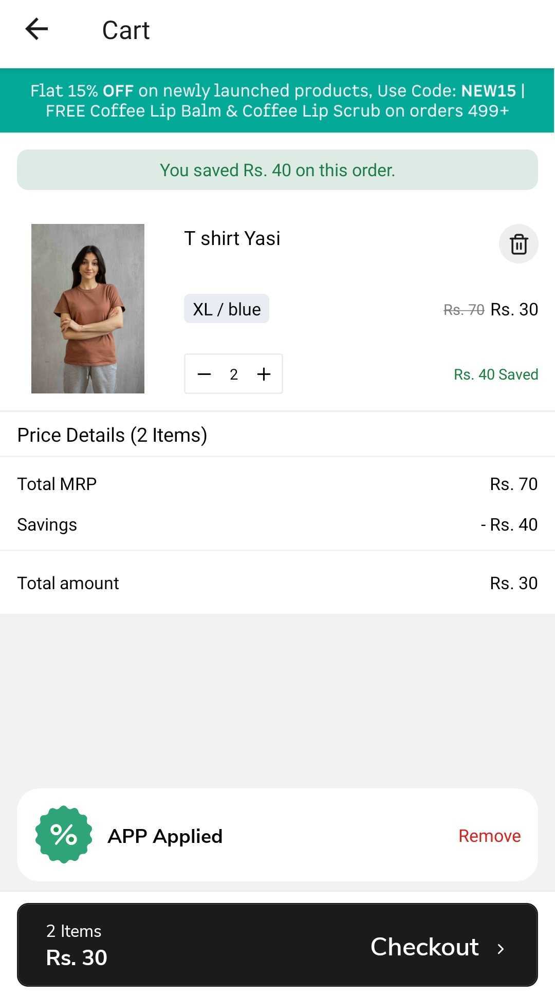
| `title` | `String` | Product title | `'T shirt Yasi'`|
| `isFreeGift` | `Boolean` | Is the product a free gift | `false` |
| `imageUri` | `String` | Product image url | `'https://cdn.shopify.com/image.jpg'` |
| `variationText` | `String` | Product variation text | `'XL / blue'` |
| `salePrice` | `String` | Product sale price | `'Rs. 60'` |
| `regularPrice` | `String` | Product regular price | `'Rs. 35'` |
| `unitRegularPrice` | `String` | Product unit regular price | `'Rs. 35'` |
| `unitSalePrice` | `String` | Product unit sale price | `'Rs. 30'` |
| `onRemoveItem` | `Function` | Removes the product from the cart | `Remove Item ` |
| `removeLoading` | `Boolean` | loading state of the remove item | `false` |
| `onSale` | `Boolean` | Is the product on sale | `true` |
| `quantity` | `Number` | Product quantity | `1` |
| `__appmakerCustomStyles` | `Object` | Custom styles | `{button: { backgroundColor: '#ee3d63', }}` |
| `onQuantityChange` | `Function` | Updates the product quantity | `Update Quantity ` |
| `quantityLoading` | `Boolean` | loading state of the quantity change | `false` |
| `itemSavingsAmount` | `String` | Product savings amount | `'40'` |
| `itemSavingsWithCurrency` | `String` | Product savings with currency | `'Rs. 40'` |
| `regularPriceWithCurrency` | `String` | Product regular price with currency | `'Rs. 35'` |
| `variantLineItemRegularPriceWithCurrency` | `String` | Product variant line item regular price with currency | `'Rs. 70'` |
| `variantLineItemSalePriceWithCurrency` | `String` | Product variant line item sale price with currency | `'Rs. 60'` |
| `discountTitle` | `String` | Product discount title | `'Discount'` |
| `currencyHelper` | `Function` | Currency helper function | `currencyHelper(200 , 'INR' ) // Rs. 200` |
| `variantTitle` | `String` | Product variant title | `'XL / blue'` |
| `lineItemTotalPrice` | `String` | Product line item total price | `'30'` |
| `variant` | [`Object`](https://shopify.dev/docs/api/storefront/2022-10/objects/ProductVariant) | Shopify Product variant |
| `increaseQuantity` | `Function` | Increases the product quantity | `Increase Quantity ` |
| `decreaseQuantity` | `Function` | Decreases the product quantity |
| `canRemoveItem` | `Boolean` | Can the product be removed | `true` |
| `canUpdateQuantity` | `Boolean` | Can the product quantity be updated | `true` |
| `lineItemRegularPrice` | `string` | Product line item regular price | `'70'` |
| `lineItemRegularPriceWithCurrency` | `String` | Product line item regular price with currency | `'Rs. 70'` |
| `lineItemSubTotalPriceWithCurrency` | `String` | Product line item sub total price with currency | `'Rs. 30'` |
| `hasDiscount` | `Boolean` | Does the product have a discount | `true` |
| `hasSavings` | `Boolean` | Does the product have savings | `false` |
| `lineItemDiscountCodes` | `Array` | Product line item discount codes | `[ 'APP' ]` |
| `isLineItemFree` | `Boolean` | Is the product line item free | `false` |
| `sku` | `String` | Product sku | `'sku-123'`|
| `customAttributes` | `Array` | Product custom attributes | `[{ key: '_appmaker', value: 'true' }]` |
Usage:
```js
import { useCartProduct } from '@appmaker-xyz/shopify';
const CartCard = (props) => {
const {
title,
imageUri,
regularPrice,
isFreeGift,
onSale,
quantity,
onRemoveItem,
removeLoading,
decreaseQuantity,
openProduct,
currencyHelper,
} = useCartProduct(props);
return (
{title}
{currencyHelper(regularPrice,'INR')} // Rs. 200
Open Product
);
};
```
# useCart (/docs/reference/hooks/cart/use-cart)
| props | Type | Description | Example |
| --- | --- | --- | --- |
| `totalQuantity` | `Number` | Total quantity of items in cart | 2 |
| `cart` | [`object`](https://shopify.dev/docs/api/storefront/latest/objects/Cart)| Cart object | |
| `lines` | `Array` | Array of cart line items (Cart API format) | |
| `lineItems` | `object` | Array of line items in cart (legacy format) | |
| `cartTotalPrice` | `Number` | Total price of cart | 70 |
| `cartTotalPricelwithCurrency` | `String` | Total price of cart with currency | Rs. 70 |
| `cartSubTotalAmount` | `Number` | Subtotal amount of cart | 30 |
| `cartTotalSavings` | `Number` | Total savings of cart | 40 |
| `cartTotalSavingsWithCurrency` | `String` | Total savings of cart with currency | Rs. 40 |
| `cartTotalPayable` | `String` | Total payable amount of cart | Rs. 30 |
| `cartTotalPayableWithCurrency` | `String` | Total payable amount of cart with currency | Rs. 30 |
| `cartDiscountSavings` | `String` | Discount savings of cart | 30 |
| `cartDiscountSavingsWithCurrency` | `String` | Discount savings of cart with currency | Rs. 30 |
| `cartTotalSavingWithoutDiscount` | `Number` | Total saving without discount of cart | 10 |
| `cartTotalSavingWithoutDiscountWithCurrency` | `String` | Total saving without discount of cart with currency | Rs. 10 |
| `shippingFee` | `Number` | Shipping fee of cart | 0 |
| `shippingFeeWithCurrency` | `String` | Shipping fee of cart with currency | Rs. 0 |
| `isFreeShipping` | `Boolean` | Is free shipping of cart | true |
| `openCheckout` | `Function` | Open checkout | `Checkout `|
| `canCheckout` | `Boolean` | Can checkout | true |
| `setCanCheckout` | `Function` | Set can checkout | ` setCanCheckout(false);` |
| `checkoutLoading` | `Boolean` | Checkout loading | false |
| `isCheckoutButtonLoading` | `Boolean` | Is checkout button loading | false |
| `deliveryGroups` | `Array` | Delivery groups from cart | |
| `discountApplications` | `Array` | Discount applications from cart | |
| `cartErrorMessages` | `Array` | Cart validation error messages | |
| `firstProductId` | `String` | ID of the first product in cart | |
| `shareCart` | `Function` | Share cart with message | `shareCart({ message: 'Check out my cart!' })` |
| `addCartDeliveryAddress` | `Function` | Add delivery address to cart | `addCartDeliveryAddress(address)` |
Usage:
```js
import { useCart } from '@appmaker-xyz/shopify';
const { cart, setCanCheckout, shareCart, addCartDeliveryAddress } = useCart({ onAction }); // You can get the above props from this hook
```

# useCurrentCart (/docs/reference/hooks/cart/use-current-cart)
Use it to access cart data outside of the cart page.
## Import [#import]
```js
import { useCurrentCart } from '@appmaker-xyz/shopify';
```
## Basic Usage [#basic-usage]
```js
const cart = useCurrentCart();
```
## Return Value [#return-value]
| Property | Type | Description |
| :--- | :--- | :--- |
| `cart` | `Object \| undefined` | The current Shopify cart object stored in app storage. Returns `undefined` if no cart exists. |
# useDiscount (/docs/reference/hooks/cart/use-discount)
| props | Type | Description | Example |
| --- | --- | --- | --- |
| `cartSubTotalAmount` | `Number` | Subtotal amount of cart | 30 |
| `couponTitle` | `String` | Coupon title | |
| `couponTitleDisplay` | `String` | Coupon title display | |
| `couponMessage` | `String` | Coupon message | |
| `appliedDiscountCodeItem` | `Object` | Applied discount code item | |
| `openCouponList` | `Function` | Open coupon list | `Open Coupon List ` |
| `couponsList` | `Array` | Coupons list | |
| `couponsListLoading` | `Boolean` | Coupons list loading | false |
| `onApplyCoupon` | `Function` | On apply coupon | `onApplyCoupon(couponCode);` |
| `onRemoveCoupon` | `Function` | On remove coupon | `onRemoveCoupon(couponCode);` |
| `hasCouponApplied` | `Boolean` | Has coupon applied | true |
| `isCouponApplyingLoading` | `Boolean` | Is coupon applying loading | false |
| `isCouponRemovingLoading` | `Boolean` | Is coupon removing loading | false |
| `canShowSuccessMessage` | `Boolean` | Can show success message | true |
| `dissmissSuccessMessage` | `Function` | Dissmiss success message | `dissmissSuccessMessage();` |
| `setSuccessMessage` | `Function` | Set success message | `setSuccessMessage('Success');` |
| `cartTotalQuantity` | `Number` | Total quantity of items in cart | 2 |
| `appliedAutomaticDiscountItem` | `Object` | automatic coupon object | |
| `hasAutomaticDiscountApplied` | `Boolean` | has automatic coupon applied | true |
# useLineItemAttributes (/docs/reference/hooks/cart/use-line-item-attributes)
It reads and writes to the page state, allowing you to attach custom key-value pairs to cart line items.
## Import [#import]
```js
import { useLineItemAttributes } from '@appmaker-xyz/shopify';
```
## Basic Usage [#basic-usage]
```jsx
const [value, setValue] = useLineItemAttributes('engraving_text');
// Read the current value
console.log(value); // ''
// Set a new value
setValue('Hello World');
```
## Parameters [#parameters]
| Parameter | Type | Description |
| :--- | :--- | :--- |
| `fieldName` | `string` | The attribute key name to manage. |
## Return Value [#return-value]
Returns a tuple `[value, setValue]`:
| Index | Type | Description |
| :--- | :--- | :--- |
| `0` | `string` | The current value of the attribute (empty string if not set). |
| `1` | `Function` | Setter function to update the attribute value. Signature: `(newValue: string) => void`. |
# useLocalCart (/docs/reference/hooks/cart/use-local-cart)
You can use this hook to get cart data outside the cart page.
## Usage [#usage]
```js
import { useLocalCart } from '@appmaker-xyz/shopify';
const { cart } = useLocalCart();
```
# useProductCartQuantity (/docs/reference/hooks/cart/use-product-cart-quantity)
If you want to get the cart quantity of a product on the product detail page, you can use this hook. You can also get the cart line item data of the product.
| Params | Description |
|--------|-------------|
| variantId | Variant id of the product |
| productId | Product id of the product |
## Usage [#usage]
```js
import { useProductCartQuantity } from '@appmaker-xyz/shopify';
const [cartQuantity, cartLineItem] = useProductCartQuantity({
variantId: productVariant?.node?.id, // Variant id of the product
});
```
```js
import { useProductCartQuantity } from '@appmaker-xyz/shopify';
const [cartQuantity, cartLineItem] = useProductCartQuantity({
productId, // Product id of the product
});
```
# Filters & sort (/docs/reference/hooks/filters-and-sort)
# useFilterOptions (/docs/reference/hooks/filters-and-sort/use-filter-options)
It allows selecting, removing, and clearing filters.
## Import [#import]
```js
import { useFilterOptions } from '@appmaker-xyz/shopify';
```
## Basic Usage [#basic-usage]
```jsx
const {
selectedFilters,
selectFilter,
removeFilter,
clearSelectedFilters,
isFilterSelected,
hasAnyFilterSelected,
priceRange,
} = useFilterOptions();
```
## Return Value [#return-value]
| Property | Type | Description |
| :--- | :--- | :--- |
| `selectedFilters` | `Object` | Currently selected filters keyed by filter key and value ID. |
| `priceRange` | `Object` | Current price range filter state. |
| `selectFilter` | `Function` | Selects a filter option. Signature: `selectFilter(filterKey, filterValueId, filterValue)`. |
| `removeFilter` | `Function` | Removes a filter option. Signature: `removeFilter(filterKey, filterValueId)`. |
| `getSelectedFilters` | `Function` | Returns the current selected filters object. |
| `isFilterSelected` | `Function` | Checks if a specific filter is selected. |
| `clearSelectedFilters` | `Function` | Clears all selected filters. |
| `hasAnyFilterSelected` | `Function` | Returns whether any filter is currently selected. |
# useProductFilterActions (/docs/reference/hooks/filters-and-sort/use-product-filter-actions)
It allows setting, removing, and clearing filters on the product list page.
## Import [#import]
```js
import { useProductFilterActions } from '@appmaker-xyz/shopify';
```
## Basic Usage [#basic-usage]
```jsx
const {
setFilter,
setFilters,
removeFilter,
removeFilters,
clearAllFilters,
openFilterModal,
currentFilters,
} = useProductFilterActions();
// Apply a single filter
setFilter({
filterKey: 'product_type',
filterValueID: 'shoes',
filterValue: { label: 'Shoes', id: 'shoes', input: '...' },
});
// Remove all filters
clearAllFilters();
```
## Return Value [#return-value]
| Property | Type | Description |
| :--- | :--- | :--- |
| `setFilter` | `Function` | Applies a single filter. Signature: `setFilter({ filterKey, filterValueID, filterValue })`. |
| `setFilters` | `Function` | Applies multiple filters at once. Signature: `setFilters([{ filterKey, filterValueID, filterValue }, ...])`. |
| `removeFilter` | `Function` | Removes a single filter. Signature: `removeFilter({ filterKey, filterValueID })`. |
| `removeFilters` | `Function` | Removes multiple filters at once. Signature: `removeFilters([{ filterKey, filterValueID }, ...])`. |
| `clearAllFilters` | `Function` | Clears all applied filters. |
| `openFilterModal` | `Function` | Opens the filter modal. Signature: `openFilterModal({ initialTabName })`. |
| `currentFilters` | `Object` | The currently applied filters object. |
# useProductFilters (/docs/reference/hooks/filters-and-sort/use-product-filters)
It supports live filter updates based on selected filter state.
## Import [#import]
```js
import { useProductFilters } from '@appmaker-xyz/shopify';
```
## Basic Usage [#basic-usage]
```jsx
// By collection ID
const { filters, isLoading, setSelectedFilters, getSingleFilter } = useProductFilters({
query: { collectionId: 'gid://shopify/Collection/123' },
});
// By collection handle
const { filters } = useProductFilters({
query: { collectionHandle: 'summer-collection' },
});
// By search query
const { filters } = useProductFilters({
query: { searchQuery: 'shoes' },
});
```
## Parameters [#parameters]
| Parameter | Type | Description |
| :--- | :--- | :--- |
| `query` | `Object` | Query input. Must contain one of: `collectionId`, `collectionHandle`, or `searchQuery`. |
| `preSelectedFilters` | `Object \| null` | Optional pre-selected filters to initialize with. |
## Return Value [#return-value]
| Property | Type | Description |
| :--- | :--- | :--- |
| `filters` | `Array` | Array of available Shopify product filters. |
| `setSelectedFilters` | `Function` | Updates the selected filters, triggering a refetch of available filters. |
| `getSingleFilter` | `Function` | Returns a single filter by key. Signature: `getSingleFilter({ filterKey })`. |
| `isLoading` | `boolean` | Whether the filter data is being fetched. |
| `isError` | `boolean` | Whether the fetch failed. |
| `isSuccess` | `boolean` | Whether the fetch succeeded. |
# useQuickFilters (/docs/reference/hooks/filters-and-sort/use-quick-filter)
It fetches the filters based on the collection ID and returns the available filters.
## Usage [#usage]
```js
import { useQuickFilters } from '@appmaker-xyz/shopify';
const { filters, isFilterLoading, applyQuickFilter, clearAllFilters, removeQuickFilter, getSingleFilter, isFilterAvailable, selectedFilters } = useQuickFilters();
```
## Example [#example]
```js
import React from 'react';
import {
FlatList,
Text,
View,
Pressable,
StyleSheet,
} from 'react-native';
import { useQuickFilters } from '@appmaker-xyz/shopify';
const QuickFilters = () => {
const {
filters,
selectedFilters,
applyQuickFilter,
removeQuickFilter,
isFilterLoading,
isFilterAvailable,
} = useQuickFilters();
if (isFilterLoading || !isFilterAvailable) return null;
const flatQuickFilters = filters.flatMap(filter =>
filter.values.map(value => ({
...value,
parentId: filter.id,
}))
);
const renderItem = ({ item }) => {
const isSelected = selectedFilters?.[item.parentId]?.[item.id];
const isDisabled = item.count === 0;
return (
{
if (isSelected) {
removeQuickFilter({ filterKey: item.parentId, filterItem: item });
} else {
applyQuickFilter({ filterKey: item.parentId, filterItem: item });
}
}}
style={({ pressed }) => [
styles.chip,
isSelected && styles.selectedChip,
isDisabled && styles.disabledChip,
pressed && !isDisabled && styles.pressedChip,
]}
>
{item.label}
);
};
return (
item.id}
horizontal
showsHorizontalScrollIndicator={false}
ItemSeparatorComponent={() =>
);
};
const styles = StyleSheet.create({
container: {
paddingVertical: 10,
backgroundColor: '#fff',
},
chip: {
height: 35,
paddingHorizontal: 16,
justifyContent: 'center',
alignItems: 'center',
borderRadius: 20,
borderWidth: 1,
borderColor: '#ccc',
backgroundColor: 'white',
},
selectedChip: {
backgroundColor: '#000',
borderColor: '#000',
},
selectedChipText: {
color: '#fff',
},
disabledChip: {
opacity: 0.4,
},
pressedChip: {
opacity: 0.7,
},
chipText: {
fontSize: 14,
color: '#333',
},
});
export default QuickFilters;
```
# useSortModal (/docs/reference/hooks/filters-and-sort/use-sort-modal)
## Import [#import]
```js
import { useSortModal } from '@appmaker-xyz/shopify';
```
## Basic Usage [#basic-usage]
```jsx
const {
isSortModalShown,
openSortModal,
closeSortModal,
context,
} = useSortModal();
```
## Return Value [#return-value]
| Property | Type | Description |
| :--- | :--- | :--- |
| `isSortModalShown` | `boolean` | Whether the sort modal is currently visible. |
| `openSortModal` | `Function` | Opens the sort modal. |
| `closeSortModal` | `Function` | Closes the sort modal. |
| `context` | `Object` | Filter store context data. |
# Appmaker Hooks (/docs/reference/hooks)
## [`useCartProduct`](/docs/reference/hooks/cart/use-cart-product) [#usecartproduct]
This hook is used to get the cart product data.
## [`useCart`](/docs/reference/hooks/cart/use-cart) [#usecart]
This hook is used to get the cart data.
## [`useProductDetail`](/docs/reference/hooks/product/use-product-detail) [#useproductdetail]
This hook is used to get the product detail data.
## [`useProductListItem`](/docs/reference/hooks/product/use-product-list-item) [#useproductlistitem]
This hook is used to get the product list item data.
## [`useProductVariations`](/docs/reference/hooks/product/use-product-variations) [#useproductvariations]
This hook is used to get the product variations in product list.
## [`useProductOptions`](/docs/reference/hooks/product/use-product-options) [#useproductoptions]
This hook is used to get the product variations in productDetail page.
## [`useDiscount`](/docs/reference/hooks/cart/use-discount) [#usediscount]
This hook is used to get the discount data.
## [`useOtpLogin`](/docs/reference/hooks/user-and-auth/use-otp-login) [#useotplogin]
This hook is used to implement OTP login in your app.
## [`useUserProfile`](/docs/reference/hooks/user-and-auth/use-user-profile) [#useuserprofile]
This hook is used to get the user profile data.
## [`useUser`](/docs/reference/hooks/user-and-auth/use-user) [#useuser]
This hook is used to get the user data.
## [`useCurrentUser`](/docs/reference/hooks/user-and-auth/use-current-user) [#usecurrentuser]
This hook is used to fetch the profile information of the currently authenticated user, including metafields.
## [`useReviewSummary`](/docs/reference/hooks/reviews/use-review-summary) [#usereviewsummary]
This hook is used to get the review summary data.
## [`useReviewListItem`](/docs/reference/hooks/reviews/use-review-list-item) [#usereviewlistitem]
This hook is used to retrieve the data for a review item and is used in the review list item component.
## [`useAddReview`](/docs/reference/hooks/reviews/use-add-review) [#useaddreview]
This hook is used to add a review.
## [`useOrderLineItem`](/docs/reference/hooks/address-and-orders/use-order-line-item) [#useorderlineitem]
This hook is used to get the order line item data.
## [`useProductImages`](/docs/reference/hooks/product/use-product-image) [#useproductimages]
This hook is used to get the product images and handle the image swiper actions. Used in the product detail page.
## [`useWishlistProductIds`](/docs/reference/hooks/wishlist/use-wishlist-product-ids) [#usewishlistproductids]
This hook is used to get the wishlist product ids.
## [`useWishlistProducts`](/docs/reference/hooks/wishlist/use-wishlist-products) [#usewishlistproducts]
This hook is used to get the wishlist products.
## [`useAddress`](/docs/reference/hooks/address-and-orders/use-address) [#useaddress]
This hook is used to get the address data.
## [`useAddressItem`](/docs/reference/hooks/address-and-orders/use-address-item) [#useaddressitem]
This hook is used to get the address item data.
## [`useAddAddress`](/docs/reference/hooks/address-and-orders/use-add-address) [#useaddaddress]
This hook is used to add an address.
## [`useProductWishList`](/docs/reference/hooks/wishlist/use-product-wishlist) [#useproductwishlist]
This hook is used to add or remove products from wishlist.
## [`useRegister`](/docs/reference/hooks/user-and-auth/use-register) [#useregister]
This hook is used to get handle register functionality.
## [`useLogin`](/docs/reference/hooks/user-and-auth/use-login) [#uselogin]
This hook is used to get handle login functionality.
## [`useForgotPassword`](/docs/reference/hooks/user-and-auth/use-forgot-password) [#useforgotpassword]
This hook allows you to send a reset password email to a customer.
## [`useNavigationActions`](/docs/reference/hooks/page-and-utils/use-navigation-actions) [#usenavigationactions]
This hook allows you to get the navigation actions.
## [`usePage`](/docs/reference/hooks/page-and-utils/use-page) [#usepage]
This hook is used to get the page data.
## [`useCartActions`](/docs/reference/hooks/cart/use-cart-actions) [#usecartactions]
This hook is used to add multiple items to the cart.
## [`useOrders`](/docs/reference/hooks/address-and-orders/use-orders) [#useorders]
This hook is used to get the order data of the user.
## [`useProducts`](/docs/reference/hooks/product/use-products) [#useproducts]
This hook is used to get the products data by passing the query params.
## [`useShopifyProduct`](/docs/reference/hooks/product/use-shopify-product) [#useshopifyproduct]
This hook is used to get the product data in a specific format by passing the product node.
## [`useLocalCart`](/docs/reference/hooks/cart/use-local-cart) [#uselocalcart]
This hook is used to get the local cart data. You can use this hook to get cart data outside the cart page.
## [`useProductCartQuantity`](/docs/reference/hooks/cart/use-product-cart-quantity) [#useproductcartquantity]
This hook is used to get the product cart quantity data.
## [`useScrollToBlock`](/docs/reference/hooks/page-and-utils/use-scroll-to-block) [#usescrolltoblock]
This hook is used to scroll to a specific block on the page.
## [`useReviewsList`](/docs/reference/hooks/reviews/use-review-list) [#usereviewslist]
This hook is used to get list of reviews
## [`useQuickFilters`](/docs/reference/hooks/filters-and-sort/use-quick-filter) [#usequickfilters]
This hook is used to get the quick filters data for a collection. It fetches the filters based on the collection ID and returns the available filters.
## [`useCurrentCart`](/docs/reference/hooks/cart/use-current-cart) [#usecurrentcart]
This hook returns the current Shopify cart object from the app's persisted storage.
## [`useUserProfileV2`](/docs/reference/hooks/user-and-auth/use-user-profile-v2) [#useuserprofilev2]
This hook provides user profile management with form validation using react-hook-form and Zod schema.
## [`useEmailOtpLogin`](/docs/reference/hooks/user-and-auth/use-email-otp-login) [#useemailotplogin]
This hook manages email-based OTP login flow, including sending, verifying, and resending OTP codes.
## [`useProductDetailV2`](/docs/reference/hooks/product/use-product-detail-v2) [#useproductdetailv2]
This hook provides product detail page functionality including add-to-cart, buy now, pricing, and selling plan support.
## [`useLineItemAttributes`](/docs/reference/hooks/cart/use-line-item-attributes) [#uselineitemattributes]
This hook manages custom line item attributes (cart item properties) on the product detail page.
## [`useProductQuantity`](/docs/reference/hooks/product/use-product-quantity) [#useproductquantity]
This hook manages the product quantity on the product detail page with min/max constraints.
## [`useFilterOptions`](/docs/reference/hooks/filters-and-sort/use-filter-options) [#usefilteroptions]
This hook provides access to the filter selection state and actions for the product list filter UI.
## [`useSortModal`](/docs/reference/hooks/filters-and-sort/use-sort-modal) [#usesortmodal]
This hook manages the visibility state of the sort modal on product list pages.
## [`useProductFilterActions`](/docs/reference/hooks/filters-and-sort/use-product-filter-actions) [#useproductfilteractions]
This hook provides actions to programmatically manage product filters from outside the filter modal.
## [`useProductFilters`](/docs/reference/hooks/filters-and-sort/use-product-filters) [#useproductfilters]
This hook fetches available product filters from Shopify for a given collection or search query.
## [`useSearch`](/docs/reference/hooks/search/use-search) [#usesearch]
This hook manages the search query state and provides the search result count.
## [`useSearchSuggest`](/docs/reference/hooks/search/use-search-suggest) [#usesearchsuggest]
This hook provides access to search suggestion terms from the block data.
## [`useSearchQuery`](/docs/reference/hooks/search/use-search-query) [#usesearchquery]
This hook manages the search input value in page state.
## [`useSearchResult`](/docs/reference/hooks/search/use-search-result) [#usesearchresult]
This hook retrieves the predictive search results stored in page state.
## [`useRecentSearch`](/docs/reference/hooks/search/use-recent-search) [#userecentsearch]
This hook manages the user's recent search history stored in AsyncStorage.
## [`usePredictiveSearch`](/docs/reference/hooks/search/use-predictive-search) [#usepredictivesearch]
This hook provides real-time predictive search results from Shopify's predictive search API with debouncing.
## [`useOrderItem`](/docs/reference/hooks/address-and-orders/use-order-item) [#useorderitem]
This hook extracts and formats order data from block attributes for rendering order items in the order list.
## [`usePageState`](/docs/reference/hooks/page-and-utils/use-page-state) [#usepagestate]
This hook provides access to the Zustand-based page-level state for reading block data, current action, and custom state.
## [`useDataSourceV2`](/docs/reference/hooks/page-and-utils/use-data-source-v2) [#usedatasourcev2]
This hook provides React Query-based data fetching for single-page and paginated data sources.
## [`useThemeSettings`](/docs/reference/hooks/page-and-utils/use-theme-settings) [#usethemesettings]
This hook returns the current theme settings object from the plugin store.
## [`useReusableBlocks`](/docs/reference/hooks/page-and-utils/use-reusable-blocks) [#usereusableblocks]
This hook provides access to the persisted reusable blocks store for managing shared block templates.
## [`useScrollValueY`](/docs/reference/hooks/page-and-utils/use-scroll-value-y) [#usescrollvaluey]
This hook returns a shared animated scroll Y value for coordinating scroll-based animations across components.
# Page & utilities (/docs/reference/hooks/page-and-utils)
# useDataSourceV2 (/docs/reference/hooks/page-and-utils/use-data-source-v2)
## Import [#import]
```js
import { useDataSourceV2 } from '@appmaker-xyz/core';
```
## Basic Usage [#basic-usage]
```jsx
const [queryResult, { item }] = useDataSourceV2({
dataSource: {
source: 'shopify',
methodName: 'productDetail',
params: { handle: 'my-product' },
dataExtractor: (response) => response?.data?.data?.product,
},
enabled: true,
});
if (queryResult.isLoading) return Go to login page ;
}
```
# usePageState (/docs/reference/hooks/page-and-utils/use-page-state)
Each page in the app has its own isolated state store containing block data, current action, metadata, and any custom state set by blocks. Use a selector function to subscribe to specific slices of state for optimal performance.
## Import [#import]
```js
import { usePageState } from '@appmaker-xyz/core';
```
## Basic Usage [#basic-usage]
```jsx
// Read specific state values using selectors
const blockData = usePageState((state) => state.blockData);
const currentAction = usePageState((state) => state.currentAction);
const isLoading = usePageState((state) => state.blockDataSourceLoading);
// Access custom state set by other blocks
const searchQuery = usePageState((state) => state.searchQuery);
// Get the setter to update page state
const setPageState = usePageState((state) => state.setPageState);
setPageState({ myCustomValue: 'hello' });
// Set a single state variable
const setPageStateVar = usePageState((state) => state.setPageStateVar);
setPageStateVar('searchQuery', 'red shoes');
```
## Parameters [#parameters]
| Parameter | Type | Description |
| :--- | :--- | :--- |
| `selector` | `Function` | A selector function that receives the full page state and returns the slice you need. E.g., `(state) => state.blockData`. |
## Available State Properties [#available-state-properties]
| Property | Type | Description |
| :--- | :--- | :--- |
| `blockData` | `Object` | Data passed to the page's blocks from the data source. |
| `blockDataSourceLoading` | `boolean` | Whether the block data source is currently loading. |
| `blockDataError` | `any` | Error from block data source fetch, if any. |
| `currentAction` | `Object` | The navigation action that opened this page (contains `params`). |
| `pageId` | `string` | The page identifier. |
| `metaData` | `Object` | Page metadata. |
| `dataSourceResponse` | `Object` | Raw data source responses keyed by name. |
## Available Actions (via selector) [#available-actions-via-selector]
| Action | Type | Description |
| :--- | :--- | :--- |
| `setPageState` | `Function` | Merges an object into page state. Signature: `setPageState({ key: value })`. |
| `setPageStateVar` | `Function` | Sets a single state variable. Signature: `setPageStateVar(name, value)`. |
| `setBlockData` | `Function` | Replaces the block data and sets loading to false. |
| `updateBlockData` | `Function` | Updates a single key in block data. Signature: `updateBlockData(key, value)`. |
| `setCurrentAction` | `Function` | Updates the current action. |
| `setMetaData` | `Function` | Updates the page metadata. |
| `setBlockDataSourceLoading` | `Function` | Sets the loading state. |
| `setBlockDataSourceResponse` | `Function` | Stores a data source response. Signature: `setBlockDataSourceResponse(name, response)`. |
# usePage (/docs/reference/hooks/page-and-utils/use-page)
| Name | Type | Description |
| --- | --- | --- |
| `id` | `String` | ID of the page |
| `handle` | `Object` | A human-friendly unique string for the page automatically generated from its title. |
| `title` | `Function` | The title of the page. |
| `body` | `HTML` | The description of the page, complete with HTML formatting. |
| `bodySummary` | `String` | Summary of the page body. |
| `onlineStoreUrl` | `String` | The URL used for viewing the resource on the shop's Online Store. |
| `pageData` | `String` | Whole object of response for the page |
## Usage: [#usage]
```js
import { usePage } from "@appmaker-xyz/shopify";
const { id, handle, title, body, bodySummary, onlineStoreUrl, pageData } =
usePage({
pageHandle: "hi-how-are-you", // the page handle
});
```
## Refer [#refer]
https://shopify.dev/docs/api/storefront/2023-07/objects/Page
# useReusableBlocks (/docs/reference/hooks/page-and-utils/use-reusable-blocks)
Reusable blocks are block configurations that can be shared across multiple pages.
## Import [#import]
```js
import { useReusableBlocks } from '@appmaker-xyz/core';
```
## Basic Usage [#basic-usage]
```jsx
// Read reusable blocks
const reusableBlocks = useReusableBlocks((state) => state.reusableBlocks);
// Get a specific reusable block
const headerBlock = reusableBlocks['header-block'];
// Add a reusable block
const addReusableBlock = useReusableBlocks((state) => state.addReusableBlock);
addReusableBlock('my-block', blockConfig);
// Set all reusable blocks
const setReusableBlocks = useReusableBlocks((state) => state.setReusableBlocks);
setReusableBlocks(allBlocks);
```
## Parameters [#parameters]
| Parameter | Type | Description |
| :--- | :--- | :--- |
| `selector` | `Function` | A selector function that receives the store state and returns the slice you need. |
## Available State [#available-state]
| Property | Type | Description |
| :--- | :--- | :--- |
| `reusableBlocks` | `Object` | Map of reusable block names to their block configurations. |
| `initialLoading` | `boolean` | Whether the persisted store is still loading from storage. |
## Available Actions [#available-actions]
| Action | Type | Description |
| :--- | :--- | :--- |
| `setReusableBlocks` | `Function` | Replaces all reusable blocks. Signature: `setReusableBlocks(blocksMap)`. |
| `addReusableBlock` | `Function` | Adds or overwrites a reusable block. Signature: `addReusableBlock(name, block)`. |
| `addDefaultReusableBlock` | `Function` | Adds a block only if it doesn't already exist. Signature: `addDefaultReusableBlock(name, block)`. |
# useScrollToBlock (/docs/reference/hooks/page-and-utils/use-scroll-to-block)
## Usage [#usage]
```js
import { useScrollToBlock } from '@appmaker-xyz/react-native';
const Button =()=> {
const { scrollToIndex } = useScrollToBlock();
return(
scrollToIndex(0)} />
)
}
```
```js
import { useScrollToBlock } from '@appmaker-xyz/react-native';
const { scrollToClientId } = useScrollToBlock();
// Specify the client ID of the block you want to scroll to
const blockClientId = 'block-unique-client-id'
// Call the scrollToClientId function to scroll to the desired block
scrollToClientId(blockClientId);
```
# useScrollValueY (/docs/reference/hooks/page-and-utils/use-scroll-value-y)
Use it to coordinate scroll-based animations across components, such as custom animated headers that respond to scroll position.
Must be used within an `AnimatedValueProvider`.
## Import [#import]
```js
import { useScrollValueY } from '@appmaker-xyz/react-native';
```
## Basic Usage [#basic-usage]
```jsx
import Animated, { useAnimatedStyle, interpolate } from 'react-native-reanimated';
const scrollY = useScrollValueY();
// Create animated styles based on scroll position
const headerStyle = useAnimatedStyle(() => ({
opacity: interpolate(scrollY.value, [0, 100], [1, 0]),
transform: [{ translateY: interpolate(scrollY.value, [0, 100], [0, -50]) }],
}));
return (
Custom Header
);
```
## Return Value [#return-value]
| Property | Type | Description |
| :--- | :--- | :--- |
| `scrollY` | `SharedValue` | A Reanimated shared value representing the current vertical scroll offset. Updated as the user scrolls. |
# useThemeSettings (/docs/reference/hooks/page-and-utils/use-theme-settings)
Use it to access theme configuration values (colors, fonts, spacing, etc.) in custom blocks.
## Import [#import]
```js
import { useThemeSettings } from '@appmaker-xyz/core';
```
## Basic Usage [#basic-usage]
```jsx
const themeSettings = useThemeSettings();
// Access theme values
const primaryColor = themeSettings?.primaryColor;
const fontFamily = themeSettings?.fontFamily;
```
## Return Value [#return-value]
| Property | Type | Description |
| :--- | :--- | :--- |
| `themeSettings` | `Object` | The theme settings object configured for the active theme. The shape depends on the theme's configuration. |
# Product (/docs/reference/hooks/product)
# useProductDetailV2 (/docs/reference/hooks/product/use-product-detail-v2)
## Import [#import]
```js
import { useProductDetailV2 } from '@appmaker-xyz/shopify';
```
## Basic Usage [#basic-usage]
```jsx
const {
product,
title,
addToCart,
buyNow,
addtoCartLoading,
buyNowLoading,
salePrice,
regularPrice,
onSale,
salePercentage,
currentVariantInStock,
selectedVariant,
count,
setCount,
updateCart,
} = useProductDetailV2({ blockData, onAction });
```
## Parameters [#parameters]
| Parameter | Type | Description |
| :--- | :--- | :--- |
| `blockData` | `Object` | Block data containing the product node. |
| `onAction` | `Function` | Action handler for cart operations and messages. |
| `showAddedToCartMessage` | `boolean` | Whether to show a toast after adding to cart. Default: `true`. |
## Return Value [#return-value]
| Property | Type | Description |
| :--- | :--- | :--- |
| `product` | `Object` | The full product object. |
| `tags` | `string[]` | Product tags. |
| `hasTag` | `Function` | Check if product has a specific tag. Signature: `hasTag(tag)`. |
| `vendorName` | `string` | Product vendor name. |
| `addToCart` | `Function` | Adds product to cart. Accepts `{ buynow, variant, sellingPlanId }`. |
| `updateCart` | `Function` | Updates cart line item quantity. Accepts `{ quantity }`. |
| `addtoCartLoading` | `boolean` | Whether the add-to-cart action is in progress. |
| `buyNow` | `Function` | Triggers buy now flow. Accepts optional `{ walletPreference }`. |
| `buyNowLoading` | `boolean` | Whether the buy now action is in progress. |
| `count` | `number` | Current quantity count. |
| `setCount` | `Function` | Sets the quantity count. |
| `salePrice` | `number` | Current sale price amount. |
| `regularPrice` | `number` | Compare-at (regular) price amount. |
| `onSale` | `boolean` | Whether the product is on sale. |
| `salePercentage` | `string \| null` | Discount percentage (e.g., `"20 %"`), or `null` if not on sale. |
| `currentVariantInStock` | `boolean` | Whether the selected variant is available for sale. |
| `selectedVariant` | `Object` | The currently selected variant from page state. |
| `regularPriceWithCurrency` | `string` | Formatted regular price with currency. Empty if same as sale price. |
| `salePriceWithCurrency` | `string` | Formatted sale price with currency. |
| `preOrderEnabled` | `boolean` | Whether pre-order is enabled for out-of-stock products. |
| `isBuyNowOnly` | `boolean` | Whether the product is tagged as buy-now-only. |
| `isDisablePurchase` | `boolean` | Whether purchasing is disabled for this product. |
| `checkStockAvailability` | `Function` | Checks if requested quantity is available. Returns `{ success, availableQuantity }`. |
| `selectedVariantStores` | `Array` | Store availability data for the selected variant. |
| `variantSellingPlans` | `Array` | Selling plan allocations for the selected variant. |
| `purchaseRequiresSellingPlan` | `boolean` | Whether a selling plan is required to purchase. |
| `setSelectedSellingPlanId` | `Function` | Sets the selected selling plan ID. |
| `selectedSellingPlanId` | `string` | Currently selected selling plan ID. |
| `addToCartText` | `string` | Label for add-to-cart button. |
| `addToCartButtonColor` | `string` | Color for add-to-cart button. |
| `addCartFontColor` | `string` | Font color for add-to-cart button. |
| `buyNowText` | `string` | Label for buy-now button. |
| `buyNowButtonColor` | `string` | Color for buy-now button. |
| `buyNowFontColor` | `string` | Font color for buy-now button. |
| `outOfStockText` | `string` | Label for out-of-stock state. |
| `outOfStockButtonColor` | `string` | Color for out-of-stock button. |
| `outOfStockFontColor` | `string` | Font color for out-of-stock button. |
# useProductDetail (/docs/reference/hooks/product/use-product-detail)
| props | Type | Description | Example |
| --- | --- | --- | --- |
| `shareProduct` | `Function` | Share product | `shareProduct()` |
| `onSale` | `Boolean` | Whether product is on sale or not | true |
| `buyNowLoading` | `Boolean` | State for buy now loading | false |
| `addtoCartLoading` | `Boolean` | State for add to cart loading | false |
| `addToCart` | `Function` | addToCart(\{buynow,appmakerAction}), by default both params are false | `addToCart()` |
| `updateCart` | `Function` | updateCart(\{ quantity = 1, appmakerAction = false }), by default quantity is 1 and appmakerAction is false | `updateCart()` |
| `count` | `Number` | Count of product | 0 |
| `adding` | `Boolean` | state for cart update | false |
| `setAdding` | `Function` | It's a state setter for cart update | `setAdding(true)` |
| `setCount` | `Function` | State setter for quantity | `setCount(1)` |
| `buyNow` | `Function` | Buy now function, buyNow() | `buyNow()` |
| `title` | `String` | Title of product | T shirt Yasi |
| `tax_included_text` | `String` | Tax included text | |
| `product_subtitle` | `String` | Product subtitle | |
| `average_rating` | `String` | Average rating | 3.43 |
| `reviews_count` | `String` | Reviews count | 14 |
| `product` | [`Object`](https://shopify.dev/docs/api/storefront/2022-10/objects/Product) | Product | |
| `salePrice` | `String` | Sale price | Rs. 30 |
| `regularPrice` | `String` | Regular price | Rs. 35 |
| `currentVariantInStock` | `Boolean` | Is current variant in stock | true |
| `regularPriceValue` | `Number` | Regular price value | 35 |
| `tags` | `String` | Tags | |
| `salePriceValue` | `Number` | Sale price value | 30 |
| `productVariant` | [`Object`](https://shopify.dev/docs/api/storefront/2022-10/objects/ProductVariant) | Product variant | |
| `variantId` | `String` | Variant id | 40018184732834 |
| `salePercentage` | `String` | Sale percentage | 14 % |
| `descriptionHtml` | `String` | HTML description of the product | `Product description
` |
| `description` | `String` | Plain text description of the product | "Product description" |
| `savedAmount` | `Number` | Amount saved on sale | 5 |
| `displayWishlist` | `Boolean` | Whether to display wishlist option | true |
| `displayShareButton` | `Boolean` | Whether to display share button | true |
| `preOrderEnabled` | `Boolean` | Whether pre-order is enabled for the product | false |
Usage:
```js
import { useProductDetail } from '@appmaker-xyz/shopify';
const { product, variantId, salePercentage ,addToCart } = useProductDetail(); // You can get the above props from this hook
const cartResp = await addToCart({
buynow: true,
appmakerAction: {
action: 'OPEN_INAPP_PAGE', // you can set a custom action here
pageId: 'cartPageCheckout',
}
});
const updateCartResp = await updateCart({
quantity: 2,
appmakerAction: {
action: 'OPEN_INAPP_PAGE', // you can set a custom action here
pageId: 'cartPageCheckout',
}
});
```
# useProductImages (/docs/reference/hooks/product/use-product-image)
Used in the product detail page.
| Param | Type | Description |
| --- | --- | --- |
| swiperRef | `object` | Image swiper ref |
| onAction | `function` | Function to handle the action |
| index | `number` | Index of current image |
| imageList | `array` | Visible image list |
| appmakerAction | `object` | Appmaker action |
| customDotColor | `string` | Image swiper dot color |
| imageRatio | `number` | Ratio of image |
| shareProduct | `function` | ShareProduct function for sharing product url if share button is placed above images |
| currentImageIndex | `number` | Current image index |
| setImageIndex | `function` | Set image index function for moving the image to the index of the new image Eg: setImageIndex(2) |
| openImage | `function` | Openimage function helps to click the current image detail. |
## Usage [#usage]
```js
import { useProductImages } from '@appmaker/shopify';
const ProductImages = (props) => {
const {
swiperRef,
onAction,
index,
imageList,
appmakerAction,
customDotColor,
imageRatio,
shareProduct,
currentImageIndex,
setImageIndex,
openImage,
} = useProductImages(props);
};
```
# useProductListItem (/docs/reference/hooks/product/use-product-list-item)
| props | Type | Description | Example |
| --- | --- | --- | --- |
|thumbnail_meta|`Object`|Thumbnail meta |`{altText: null, height: 1039, src: "https://cdn.shopify.com/s/files/1/0571/2193/1426/products/518s6Q_2BEqxL._AC_UX522.jpg?v=1622444565", url: "https://cdn.shopify.com/s/files/1/0571/2193/1426/products/518s6Q_2BEqxL._AC_UX522_500x500.jpg?v=1622444565", width: 522}`|
|wishList| `Boolean` | If product is in wishlist or not | `true` |
|productType| `String` | Product type | `normal` |
|firstAvailableVariant| [`Object`](https://shopify.dev/docs/api/storefront/2022-10/objects/ProductVariant) | First available variant | |
|product| [`Object`](https://shopify.dev/docs/api/storefront/2022-10/objects/Product) | Product object | |
|containerWidth| `Number` | Container width | `196.36363636363637` |
|onQuantityChange| `Function` | Function to change quantity | |
|addingTocartLoading| `Boolean` | add to cart loading | `false` |
|openProduct| `Function` | Function to open product detail | |
|onOpenProductDetail| `Function` | Function to open product detail | |
|outOfStock| `Boolean` | If product is out of stock | `false` |
|imageAspectRatio| `Number` | Image aspect ratio | `1` |
|imageRatio| `Number` | Image ratio | `1` |
|isProductListPage| `Boolean` | If product list page | `true` |
|hasTag| `Function` | Function to check if product has tag | |
|onSaved| `Function` | Function to save product | |
|title| `String` | Product title | `Appmaker Free gift` |
|imageUrl| `String` | Product image url | `https://cdn.shopify.com/s/files/1/0571/2193/1426/products/gift-box-with-red-bow_120072-333_500x500.jpg?v=1664447615` |
|salePercentage| `string` | Sale percentage | `20%`
|salePrice| `Number` | Sale price | `20` |
|regularPrice| `Number` | Regular price | `20` |
|onAddToCart| `Function` | Function to add product to cart | |
|isAddToCartLoading| `Boolean` | If add to cart loading | `false` |
|average_rating| `Number` | Average rating | `4.5` |
|reviews_count| `Number` | Reviews count | `2` |
|gridViewListing| `Boolean` | If grid view listing | `true` |
|addToCart| `Function` | Function to add product to cart | |
|count| `Number` | Product count | `1` |
|updateCart| `Function` | Function to update cart | |
|adding| `Boolean` | If adding to cart | `false` |
|setAdding| `Function` | Function to set adding to cart | |
|show_last_few_remaining| `Boolean` | If show last few remaining | `true` |
|show_last_few_remaining_text| `String` | Show last few remaining text | `Only 2 left in stock` |
|brandColor| `String` | Brand color | `#000000` |
|numColumns| `Number` | Number of columns | `3` |
|onSale| `Boolean` | If product is on sale | `true` |
|tags| `Array` | Product tags | `["gift"]` |
|salePriceValue| `Number` | Sale price value | `20` |
|regularPriceValue| `Number` | Regular price value | `20` |
|hasReviews| `Boolean` | If product has reviews | `true` |
|custom_fields| `Array` | Custom fields | `[{key: "custom_field_1", value: "custom_field_1_value"}, {key: "custom_field_2", value: "custom_field_2_value"}]` |
|productNode| [`Object`](https://shopify.dev/docs/api/admin-graphql/latest/objects/Product) | Product node | |
| isWishlistPage | `Boolean` | If it's wishlist page | `true` |
| vendorName | `String` | Vendor name | `Vendor` |
| showVendorName | `Boolean` | If show vendor name | `false` |
# UseProductOptions (/docs/reference/hooks/product/use-product-options)
It returns the variation options, selected options, and functions to set the selected options and check if an option is available for a variation option.
This hook is used only in the `ProductDetail` component to render the variation options for a product.
Use [`useProductVariations`](/docs/reference/hooks/product/use-product-variations) hook to get the variation options for a product in `product list`.
## Table of Contents [#table-of-contents]
| props | type | description |
| ----- | ---- | ----------- |
| variationOptions | array | This is the list of variation options for the product. |
| setOption | function | This function is used to set the selected option for a variation option. It will update the selectedOptions state. You can call it like setOption(optionName, optionValue) |
| selectedOptions | object | This is the state that contains the selected options for all the variation options. |
| isOptionAvilableV2 | function | This function is used to check if a particular option is available for a variation option. It will return true if the option is available, otherwise false. You can call it like isOptionAvilableV2(optionName, optionValue) |
| getAvailableOptions | function | This function is used to get the available options for a variation option. It will return the available options for the variation option. |
| product | object | This is the product object that is similar to the one returned by the useProductDetail hook. |
| variants | array | This is the list of variants for the product. |
| options | array | This is the list of options for the product. |
## Example of using the useProductOptions hook [#example-of-using-the-useproductoptions-hook]
```js
import { useProductOptions } from '@appmaker-xyz/shopify';
import React from 'react';
import { View } from 'react-native';
import ColorPicker from './ProductColorPicker';
import SizePicker from './ProductSizePicker';
import ProductVariationSelect from './ProductVariationSelect';
export default function VariationChooser(props) {
const {
variationOptions,
setOption,
selectedOptions,
isOptionAvilableV2,
getAvailableOptions,
} = useProductOptions(props);
const VariationOptionsItems = (props) => {
// In the following code, you can see for different variation options, we are rendering different components.
const { name } = props;
switch (name) {
case 'Size':
// SizePicker is a custom component that we have created to render the size options.
return (
);
case 'Color':
// ColorPicker is a custom component that we have created to render the color options.
return (
{variationOptions.map((variationOption) => {
return (
{
setOption(variationOption.key, item.value);
}}
/>
);
})}
);
}
```
# useProductQuantity (/docs/reference/hooks/product/use-product-quantity)
It reads and writes the quantity in page state with optional min/max constraints.
## Import [#import]
```js
import { useProductQuantity } from '@appmaker-xyz/shopify';
```
## Basic Usage [#basic-usage]
```jsx
const { productQuantity, setProductQuantity } = useProductQuantity({
minQuantity: 1,
maxQuantity: 10,
});
// Increase quantity
setProductQuantity(productQuantity + 1);
```
## Parameters [#parameters]
| Parameter | Type | Default | Description |
| :--- | :--- | :--- | :--- |
| `minQuantity` | `number` | `1` | Minimum allowed quantity. |
| `maxQuantity` | `number` | `undefined` | Maximum allowed quantity. No upper limit if not set. |
## Return Value [#return-value]
| Property | Type | Description |
| :--- | :--- | :--- |
| `productQuantity` | `number` | The current product quantity (defaults to `1`). |
| `setProductQuantity` | `Function` | Sets the quantity. Ignores values outside min/max range. Signature: `(quantity: number) => void`. |
# useProductVariations (/docs/reference/hooks/product/use-product-variations)
This hook is used only in the `ProductList` component to render the variation options for a product.
For `ProductDetail` component, use the [`useProductOptions`](/docs/reference/hooks/product/use-product-options) hook.
|props|type|description|
|---|---|---|
|isSingleVariation|boolean||
|isMultiOptions|boolean||
|options|object||
|selectedOptions|object||
|selectedVariant|object||
|setOptions|function||
|variant|object||
|salePrice|number||
|regularPrice|number||
|regularPriceWithCurrency| string||
|salePriceWithCurrency| string||
|imageUrl| string||
|salePercentage| number||
|onSale| boolean||
|isVariantAvailable| boolean||
Usage:
```js
import { useProductVariations } from '@appmaker-xyz/shopify';
export default function ProductListItem(props) {
const {
options,
setOptions,
variant,
selectedVariant,
salePrice,
regularPrice,
imageUrl,
selectedOptions,
salePercentage,
onSale,
regularPriceWithCurrency,
salePriceWithCurrency,
isMultiOptions,
isVariantAvailable,
} = useProductVariations(props);
return (
{variant.title}
);
```
`setoptions` function is used to set the selected options.
```js
{isMultiOptions ? (
{options?.map?.((opt) =>
Object.values(opt?.values).map((item, index) => (
{
setOptions({ [opt.label]: item.id });
}}>
)),
)}
) : null}
```
# useProducts (/docs/reference/hooks/product/use-products)
| Params | Description |
|--------|-------------|
| query | Data to be fetched |
| filters | Filters to be applied |
| sort | Sort to be applied |
| limit | Limit of data to be fetched |
## Usage [#usage]
```js
import { useProducts } from '@appmaker-xyz/shopify';
const {
data,
isLoading,
isError,
hasNextPage,
fetchNextPage,
isFetchingNextPage,
productList,
isFetching,
} = useProducts({ query, filters: appliedFilters, sort: appliedSort, limit });
```
## Example : Fetch products by product ids [#example--fetch-products-by-product-ids]
```js
import { useProducts } from '@appmaker-xyz/shopify';
const productIds = ['gid://shopify/Product/123456789', 'gid://shopify/Product/987654321'];
const { productList } = useProducts({ query: { productIds } });
```
## Example : Fetch products by collection id with filters and sort [#example--fetch-products-by-collection-id-with-filters-and-sort]
```js
import { useProducts } from '@appmaker-xyz/shopify';
import { usePageState } from '@appmaker-xyz/core';
const appliedFilter = usePageState((state) => state.filter);
const appliedSort = usePageState((state) => state.sort);
const { productList } = useProducts({
query: { collectionId: 'gid://shopify/Collection/268904398894' }, // Fetch products by collection id
filters: appliedFilters,
sort: appliedSort,
});
```
## Example : Fetch products by collection id [#example--fetch-products-by-collection-id]
```js
import { useProducts } from '@appmaker-xyz/shopify';
const { productList } = useProducts({
query: { collectionId: 'gid://shopify/Collection/268904398894' }, // Fetch products by collection id
limit: 10,
});
```
## Example : Fetch products by recommendation id [#example--fetch-products-by-recommendation-id]
```js
import { useProducts } from '@appmaker-xyz/shopify';
const { productList } = useProducts({
query: { productRecommendationId: 'gid://shopify/Product/123456789' }, // Fetch products by recommendation id
limit: 10,
});
```
## Example : Fetch products by search query [#example--fetch-products-by-search-query]
```js
import { useProducts } from '@appmaker-xyz/shopify';
const { productList } = useProducts({
query: { searchQuery: 'T-shirt' }, // Fetch products by search query
limit: 10,
});
```
# useShopifyProduct (/docs/reference/hooks/product/use-shopify-product)
| Params | Description |
|--------|-------------|
| product | Product node to be fetched |
## Usage [#usage]
```js
import { useShopifyProduct } from '@appmaker-xyz/shopify';
const {
compareAtPriceRange,
priceRange,
onSale,
tags,
salePercentage,
availableForSale,
product,
title,
imageUrl,
regularPrice,
regularPriceWithCurrency,
} = useShopifyProduct({ product });
```
### useShopifyProductV2 [#useshopifyproductv2]
Another version of the `useShopifyProduct` hook is `useShopifyProductV2` which is used to get the product data in a specific format by passing the product node.
#### Usage [#usage-1]
```js
import { useShopifyProductV2 } from '@appmaker-xyz/shopify';
const {
id,
title,
featureImageUrl,
images,
openProduct,
regularPriceWithCurrency,
salePriceWithCurrency,
isOnSale,
salePercentage,
firstAvailableVariant,
finalRegularPrice,
finalSalePrice,
salePrice,
regularPrice
} = useShopifyProductV2({ product });
```
# Reviews (/docs/reference/hooks/reviews)
# useAddReview (/docs/reference/hooks/reviews/use-add-review)
| Params | Description |
|--------|-------------|
| setName | setState for `name` |
| setEmail | setState for `email` |
| setRating | setState for `rating` |
| setTitle | setState for `title` |
| setBody | setState for `body` |
| user | Current user data |
| onSubmitReview | async Function, call on review submission |
| isLoading | boolean value to show loading on submitting review |
| name | name of the reviewer |
| email | email of the reviewer |
| rating | rating given by the reviewer |
| title | title of the review |
| body | body of the review |
State are handled inside hook, call setState on input value change directly.
## Usage [#usage]
```js
const AddReview = (props) => {
const {
onSubmitReview,
isLoading,
setName,
setRating,
setEmail,
setBody,
setTitle,
name,
email,
rating,
body,
title,
user,
} = useAddReview(props);
return (
Submit Review
);
};
```
# useReviewListItem (/docs/reference/hooks/reviews/use-review-list-item)
| Parameter Name | Description |
|----------------|-------------|
| body | Review Content |
| title | Review Title |
| reviewer | Author details |
| imageUrls | Images uploaded with the review |
| created_at | Created At in 'from now' format |
| rating | Review rating |
| verified | Verified Purchase |
| pictures | Review pictures |
# useReviewsList (/docs/reference/hooks/reviews/use-review-list)
It provides functionality for filtering, pagination, and handling loading states.
## Usage [#usage]
```js
import { useReviewsList } from '@appmaker-xyz/shopify';
const {
reviews,
isLoading,
isError,
hasNextPage,
fetchNextPage,
isPageFetching,
filters,
setFilters,
resetFilters,
rating,
setRating,
limit,
setLimit
} = useReviewsList({ productId, filters });
```
## Parameters [#parameters]
| Field | Type | Description |
|---------------------------|-------------|----------------------------------------------------------|
| `productId` | `string` | The ID of the product to fetch reviews for. |
| `filters` (optional) | | Initial filters to apply to the reviews. |
| `default` | `boolean` | Whether to use default filters. |
| `limit` | `number` | The maximum number of reviews to fetch. |
| `rating` | `number` | The minimum rating to filter by. |
## Returns [#returns]
| Field | Type | Description |
|---------------------------|-------------|----------------------------------------------------------|
| `reviews` | `array` | The list of fetched reviews. |
| `isLoading` | `boolean` | Whether the reviews are currently being fetched. |
| `isError` | `boolean` | Whether an error occurred during fetching. |
| `hasNextPage` | `boolean` | Whether there are more reviews to fetch. |
| `fetchNextPage` | `function` | Function to fetch the next page of reviews. |
| `isPageFetching` | `boolean` | Whether the next page is currently being fetched. |
| `filters` | `object` | The current filters applied. |
| `setFilters` | `function` | Function to set new filters. |
| `resetFilters` | `function` | Function to reset filters to default. |
| `rating` | `number` | The current rating filter. |
| `setRating` | `function` | Function to set a new rating filter. |
| `limit` | `number` | The current limit filter. |
| `setLimit` | `function` | Function to set a new limit filter. |
## Example [#example]
Here's an example of how to use the useReviewsList hook in a React component:
```js
import React from 'react';
import {
StyleSheet,
View,
FlatList,
Pressable,
Text,
ActivityIndicator,
} from 'react-native';
import { useReviewsList } from '@appmaker-xyz/shopify';
const ReviewList = ({
pageData,
attributes,
BlocksView,
innerBlocks,
blockData,
BlockItem,
onAction,
BlockItemRender,
...props
}) => {
const {
reviews,
isLoading,
isError,
hasNextPage,
fetchNextPage,
isPageFetching,
rating,
setRating,
} = useReviewsList({
productId: blockData?.productId || blockData?.node?.id,
filters: {
default: true,
limit: 10,
},
});
const renderItem = ({ item }) => {
return (
{Array.from({ length: 6 }).map((_, index) => {
const isPressed =
index === rating || (rating === undefined && index === 0);
return (
setRating(index === 0 ? undefined : index)}
style={[
styles.starsPressable,
{
backgroundColor: isPressed ? '#2c2c2c' : '#fff',
},
]}>
{index === 0 ? 'All' : `${index} Star${index > 1 ? 's' : ''}`}
);
})}
{isError ? (
Error loading reviews
) : isLoading ? (
item?.reviewer?.name?.toString() + item?.created_at?.toString()
}
onEndReached={() => hasNextPage && fetchNextPage()}
onEndReachedThreshold={0.1}
ListFooterComponent={() =>
isPageFetching ? (
No reviews found
)}
/>
{reviews?.length > 0 && (
);
};
const styles = StyleSheet.create({
headerContainer: {
flexDirection: 'row',
justifyContent: 'space-between',
paddingHorizontal: 10,
alignItems: 'center',
marginBottom: 10,
},
starsPressable: {
borderWidth: 1,
borderColor: '#ccc',
paddingHorizontal: 8,
paddingVertical: 4,
borderRadius: 10,
},
listEmptyComponent: {
color: '#2c2c2c',
fontSize: 12,
textAlign: 'center',
marginVertical: 10,
},
});
export default ReviewList;
```
# useReviewSummary (/docs/reference/hooks/reviews/use-review-summary)
sample usage:
```js
const {
average_rating,
total_questions,
total_reviews,
ratings,
productId,
openAddReview,
isLoading,
} = useReviewSummary(props);
```
### Hook return data [#hook-return-data]
| Name | Description | |
| --- | --- | --- |
| average_rating | Average Review with 1 decimal point |
| total_reviews | Total number of reviews |
| productId | Current product ID |
| ratings | Array of object with ratings data, sample: [\{ rating, percentage, count}] |
| total_questions | Total number of questions |
| onShowFullReview | Function to Open review list |
| openAddReview | Function to Open add review page |
| isLoading | Boolean value to show loading while data is being retrieved |
# Search (/docs/reference/hooks/search)
# usePredictiveSearch (/docs/reference/hooks/search/use-predictive-search)
It debounces the search term (300ms) and returns matching queries, collections, and products.
## Import [#import]
```js
import { usePredictiveSearch } from '@appmaker-xyz/shopify';
```
## Basic Usage [#basic-usage]
```jsx
const { results, isLoading } = usePredictiveSearch(searchTerm);
// Access result sections
const suggestedQueries = results?.queries;
const matchingCollections = results?.collections;
const matchingProducts = results?.products;
```
## Parameters [#parameters]
| Parameter | Type | Description |
| :--- | :--- | :--- |
| `searchTerm` | `string` | The search term to query. The hook debounces this value by 300ms. |
## Return Value [#return-value]
| Property | Type | Description |
| :--- | :--- | :--- |
| `results` | `Object` | The predictive search response containing `queries`, `collections`, and `products` arrays. |
| `results.queries` | `Array<{ text, trackingParameters }>` | Suggested search query strings. |
| `results.collections` | `Array<{ handle, trackingParameters }>` | Matching collections. |
| `results.products` | `Array<{ handle, trackingParameters }>` | Matching products. |
| `isLoading` | `boolean` | Whether the search request is in progress. Only `true` when there is a valid (non-empty) search term. |
# useRecentSearch (/docs/reference/hooks/search/use-recent-search)
It automatically saves searches triggered by the `product.search` event and provides methods to retrieve, clear, and remove individual queries.
## Import [#import]
```js
import { useRecentSearch } from '@appmaker-xyz/shopify';
```
## Basic Usage [#basic-usage]
```jsx
const { queries, getQueries, clearQueries, removeQuery } = useRecentSearch();
// Display recent searches
queries.map((query) => {query} );
// Clear all search history
clearQueries();
// Remove a specific query
removeQuery('red shoes');
```
## Return Value [#return-value]
| Property | Type | Description |
| :--- | :--- | :--- |
| `queries` | `string[]` | Array of recent search query strings (most recent first, max 10). |
| `getQueries` | `Function` | Fetches all recent search queries from storage. Returns `Promise`. |
| `clearQueries` | `Function` | Clears all recent search history. Returns `Promise`. |
| `removeQuery` | `Function` | Removes a specific query from history. Signature: `removeQuery(query: string) => Promise`. |
# useSearchQuery (/docs/reference/hooks/search/use-search-query)
It provides the current search query and a setter to update it, typically used with the search input field.
## Import [#import]
```js
import { useSearchQuery } from '@appmaker-xyz/shopify';
```
## Basic Usage [#basic-usage]
```jsx
const { searchQuery, setSearchQuery } = useSearchQuery();
// Update the search input
setSearchQuery('red shoes');
```
## Return Value [#return-value]
| Property | Type | Description |
| :--- | :--- | :--- |
| `searchQuery` | `string` | The current search input value (defaults to empty string). |
| `setSearchQuery` | `Function` | Updates the search input value in page state. Signature: `(value: string) => void`. |
# useSearchResult (/docs/reference/hooks/search/use-search-result)
Use it to display search result suggestions (queries, collections, products) from the predictive search feature.
## Import [#import]
```js
import { useSearchResult } from '@appmaker-xyz/shopify';
```
## Basic Usage [#basic-usage]
```jsx
const { predictiveSearchResult } = useSearchResult();
// Access search result sections
const queries = predictiveSearchResult?.queries;
const products = predictiveSearchResult?.products;
const collections = predictiveSearchResult?.collections;
```
## Return Value [#return-value]
| Property | Type | Description |
| :--- | :--- | :--- |
| `predictiveSearchResult` | `Object \| undefined` | The predictive search results object containing `queries`, `collections`, and `products` arrays. |
# useSearchSuggest (/docs/reference/hooks/search/use-search-suggest)
## Import [#import]
```js
import { useSearchSuggest } from '@appmaker-xyz/shopify';
```
## Basic Usage [#basic-usage]
```jsx
const { data, terms } = useSearchSuggest({ blockData });
```
## Parameters [#parameters]
| Parameter | Type | Description |
| :--- | :--- | :--- |
| `blockData` | `Object` | Block data containing search suggestion terms. |
## Return Value [#return-value]
| Property | Type | Description |
| :--- | :--- | :--- |
| `data` | `Object` | The raw block data passed to the hook. |
| `terms` | `Array` | Array of search suggestion term objects. Empty array if no terms available. |
# useSearch (/docs/reference/hooks/search/use-search)
## Import [#import]
```js
import { useSearch } from '@appmaker-xyz/shopify';
```
## Basic Usage [#basic-usage]
```jsx
const { query, setQuery, suggestLoading, searchResultCount } = useSearch();
// Update the search query
setQuery('sneakers');
```
## Return Value [#return-value]
| Property | Type | Description |
| :--- | :--- | :--- |
| `query` | `string` | The current search query string. |
| `setQuery` | `Function` | Updates the search query in page state. Signature: `setQuery(query)`. |
| `suggestLoading` | `boolean` | Whether search suggestions are loading. |
| `searchResultCount` | `number` | Total count of products matching the search query. |
# User & auth (/docs/reference/hooks/user-and-auth)
# useCurrentUser (/docs/reference/hooks/user-and-auth/use-current-user)
This is useful for building custom account pages or displaying personalized content.
## Import [#import]
```tsx
import { useCurrentUser } from '@appmaker-xyz/shopify';
```
## Basic Usage [#basic-usage]
```tsx
const { data: user, isLoading } = useCurrentUser({});
if (isLoading) return
Welcome back, {user?.firstName}!
Email: {user?.email}
);
```
## Using Metafields [#using-metafields]
You can fetch specific Shopify customer metafields by passing an array to the hook.
```tsx
const { data: user } = useCurrentUser({
metafields: [
{ namespace: "custom", key: "loyalty_points" },
{ namespace: "appmaker", key: "membership_type" }
]
});
// Accessing the retrieved metafields
const loyaltyPoints = user?.metafields?.find(
m => m.namespace === "custom" && m.key === "loyalty_points"
)?.value;
```
## Hook API [#hook-api]
### Parameters [#parameters]
| Parameter | Type | Description |
| :--- | :--- | :--- |
| `metafields` | `Array<{ namespace: string, key: string }>` | Optional. List of Shopify metafield identifiers to fetch. |
### Return Value [#return-value]
| Property | Type | Description |
| :--- | :--- | :--- |
| `data` | `Object` | The user object containing `firstName`, `email`, `tags`, `phone`, `metafields`, etc. |
| `isLoading` | `boolean` | Indicates if the request is in progress. |
| `isSuccess` | `boolean` | True if the data was fetched successfully. |
| `isError` | `boolean` | True if the fetch request failed. |
| `error` | `any` | Error details if `isError` is true. |
# useEmailOtpLogin (/docs/reference/hooks/user-and-auth/use-email-otp-login)
## Import [#import]
```js
import { useEmailOtpLogin } from '@appmaker-xyz/shopify';
```
## Basic Usage [#basic-usage]
```jsx
const {
currentStep,
sendCode,
verifyCode,
resendCode,
reset,
sendStatus,
verifyStatus,
verifyErrorMessage,
resendStatus,
failedAttemptCount,
otpDigitCount,
} = useEmailOtpLogin({ handleAction, redirectAction });
```
## Parameters [#parameters]
| Parameter | Type | Description |
| :--- | :--- | :--- |
| `handleAction` | `Function` | Action handler for navigation and displaying messages. |
| `redirectAction` | `Object` | Optional action to execute after successful login. |
| `ignoreLoginRedirect` | `boolean` | If `true`, skips the default post-login redirect. Default: `false`. |
| `initialData` | `Object` | Optional additional data to send with the OTP request. |
## Return Value [#return-value]
| Property | Type | Description |
| :--- | :--- | :--- |
| `currentStep` | `string` | Current step in the OTP flow: `'send'`, `'verify'`, or `'done'`. |
| `sendCode` | `Function` | Sends an OTP to the provided email. Signature: `sendCode(email)`. |
| `verifyCode` | `Function` | Verifies the OTP code. Signature: `verifyCode(otpCode)`. |
| `resendCode` | `Function` | Resends the OTP to the email. Signature: `resendCode(email)`. |
| `reset` | `Function` | Resets the OTP flow back to the `'send'` step. |
| `sendStatus` | `string` | Status of the send request: `'idle'`, `'loading'`, `'success'`, or `'error'`. |
| `sendErrorMessage` | `string \| null` | Error message from the send request, if any. |
| `verifyStatus` | `string` | Status of the verify request: `'idle'`, `'loading'`, `'success'`, or `'error'`. |
| `verifyErrorMessage` | `string \| null` | Error message from the verify request, if any. |
| `resendStatus` | `string` | Status of the resend request: `'idle'`, `'loading'`, `'success'`, or `'error'`. |
| `resendErrorMessage` | `string \| null` | Error message from the resend request, if any. |
| `failedAttemptCount` | `number` | Number of failed verification attempts. |
| `otpDigitCount` | `number` | Expected number of OTP digits (default: 4). |
| `email` | `string \| null` | The email address the OTP was sent to. |
| `canResend` | `boolean` | Whether the OTP can be resent. |
# useForgotPassword (/docs/reference/hooks/user-and-auth/use-forgot-password)
| props | Type | Description | Example |
| --- | --- | --- | --- |
| `control` | `Object` | This is the react-hook-form control object | |
| `handleSubmit` | `Function` | handle submit | |
| `formState` | `Object` | This is the react-hook-form formState object | |
| `submit` | `Function` | submit forgot password | |
| `isLoading` | `Boolean` | loading state | false |
| `isSuccess` | `Boolean` | success state | false |
## Usage [#usage]
```js
import { useForgotPassword } from '@appmaker-xyz/shopify';
const {
control,
handleSubmit,
formState,
submit,
isLoading,
isSuccess,
} = useForgotPassword();
```
# useLogin (/docs/reference/hooks/user-and-auth/use-login)
| props | Type | Description | Example |
| --- | --- | --- | --- |
| `control` | `Object` | This is the react-hook-form control object | |
| `handleSubmit` | `Function` | handle submit | |
| `formState` | `Object` | This is the react-hook-form formState object | |
| `submitLogin` | `Function` | submit login | |
| `isLoading` | `Boolean` | loading state | false |
## Usage [#usage]
```js
import { useLogin } from '@appmaker-xyz/shopify';
const {
control,
handleSubmit,
formState,
submitLogin,
isLoading,
} = useLogin();
```
# useOtpLogin (/docs/reference/hooks/user-and-auth/use-otp-login)
## prerequisites [#prerequisites]
You need to have an OTP login extension installed in your app.
## Hooks [#hooks]
`useOtpLogin` hook is used to implement OTP login in your app.
## Properties [#properties]
| Name | Type | Description | Example |
| :--- | :--- | :--- | :--- |
| sendCode | function | Function to send OTP code | sendCode(phoneNumber) |
| verifyCode | function | Function to verify OTP code | verifyCode(otpCode) |
| resendCode | function | Function to resend OTP code | resendCode(phoneNumber) |
| reset | function | Function to reset OTP login | reset() |
| currentStep | string | Current step of OTP login | 'send' \| 'verify' \| 'done' |
| sendStatus | string | Status of send OTP code | 'loading' \| 'success' \| 'error' |
| verifyErrorMessage | string | Error message of verify OTP code | 'Invalid OTP' |
| resendStatus | string | Status of resend OTP code | 'loading' \| 'success' \| 'error' |
| resendErrorMessage | string | Error message of resend OTP code | 'Invalid phone number' |
| failedAttemptCount | number | Failed attempt count | 2 |
| verifyStatus | string | Status after submitting OTP | 'loading' \| 'success' \| 'error'|
## Usage [#usage]
```
const {
sendCode,
verifyCode,
resendCode,
reset,
currentStep,
sendStatus,
verifyErrorMessage,
resendStatus,
resendErrorMessage,
failedAttemptCount,
} = useOtpLogin({ handleAction });
```
# useRegister (/docs/reference/hooks/user-and-auth/use-register)
| props | Type | Description | Example |
| --- | --- | --- | --- |
| `control` | `Object` | This is the react-hook-form control object | |
| `handleSubmit` | `Function` | handle submit | |
| `formState` | `Object` | This is the react-hook-form formState object | |
| `submitRegister` | `Function` | submit register | |
| `isLoading` | `Boolean` | loading state | false |
## Usage [#usage]
```js
import { useRegister } from '@appmaker-xyz/shopify';
const {
control,
handleSubmit,
formState,
submitRegister,
isLoading,
} = useRegister();
```
# useUserProfileV2 (/docs/reference/hooks/user-and-auth/use-user-profile-v2)
It allows reading and updating the current user's profile (first name, last name, email, phone).
## Import [#import]
```js
import { useUserProfileV2 } from '@appmaker-xyz/shopify';
```
## Basic Usage [#basic-usage]
```jsx
const {
user,
firstName,
lastName,
email,
phone,
control,
handleSubmit,
formState,
updateProfile,
isLoading,
} = useUserProfileV2({ attributes, onAction, coreDispatch });
```
## Parameters [#parameters]
| Parameter | Type | Description |
| :--- | :--- | :--- |
| `attributes` | `Object` | Block attributes passed to the component. |
| `onAction` | `Function` | Action handler for navigation and messages. |
| `coreDispatch` | `Function` | Core dispatch function for updating app state. |
| `defaultValues` | `Object` | Optional default values for the form fields. |
## Return Value [#return-value]
| Property | Type | Description |
| :--- | :--- | :--- |
| `user` | `Object` | The current user object from app storage. |
| `firstName` | `string` | User's first name. |
| `lastName` | `string` | User's last name. |
| `email` | `string` | User's email address. |
| `phone` | `string` | User's phone number. |
| `updateProfile` | `Function` | Submits the profile update form to Shopify. |
| `isLoading` | `boolean` | Whether the profile update is in progress. |
| `control` | `Object` | `react-hook-form` control object for form inputs. |
| `handleSubmit` | `Function` | `react-hook-form` submit handler. |
| `formState` | `Object` | `react-hook-form` form state (errors, dirty fields, etc.). |
| `setError` | `Function` | `react-hook-form` function to manually set field errors. |
| `setFocus` | `Function` | `react-hook-form` function to programmatically focus a field. |
# useUserProfile (/docs/reference/hooks/user-and-auth/use-user-profile)
You can edit the user profile and change the password using this hook.
| Props | Type | Description |
| --- | --- | --- |
| `user` | `Object` | Current user object |
| `firstName` | `String` | First name of user( firstName set by setNewFirstName) |
| `lastName` | `String` | Last name of user (lastName set by setNewLastName)|
| `email` | `String` | Email of user (email set by setNewEmail) |
| `phone` | `String` | Phone of user (phone set by setNewPhone) |
| `setNewFirstName` | `Function` | State set function for first name |
| `setNewLastName` | `Function` | State set function for last name |
| `setNewEmail` | `Function` | State set function for email |
| `setNewPhone` | `Function` | State set function for phone |
| `setNewPassword` | `Function` | State set function for password |
| `setConfirmPassword` | `Function` | State set function for confirm password |
| `updateProfile` | `Function` | Function to update profile. no params need to be passed |
| `changePassword` | `Function` | Function to update user Password no params need to be passed. |
| `isLoading` | `Boolean` | Returns loading state of update. |
- State for each field is handled inside hooks ( refer example for details )
- Pass the props received in blocks into hook
### Example on Updating user profile data [#example-on-updating-user-profile-data]
```js
const UserProfileUpdate = (props) => {
const {
setNewFirstName,
setNewLastName,
setNewEmail,
setNewPhone,
firstName,
lastName,
email,
phone,
isLoading,
updateProfile,
} = useUserProfile(props);
return (
Update Profile
);
};
```
### Example on Updating user Password [#example-on-updating-user-password]
```js
const UpdatePassword = (props) => {
const {
changePassword,
setNewPassword,
setConfirmPassword,
isLoading,
} = useUserProfile(props);
return (
Update Profile
);
};
```
# useUser (/docs/reference/hooks/user-and-auth/use-user)
| Name | type | Description | params |
| --- | --- | --- | --- |
| user | Object | Current logged in user data | |
| register | Function | function to register user | (email, phone, first_name, last_name, password, accepts_marketing, agree_terms )|
| login | Function | Function to login user. | ( username, password ) |
| loginViaGoogle | Function | Login User via Google provider. | |
| loginLoadingStatus | boolean | Key show loading in UI | |
| isLoggedin | boolean | Key to check if user is logged in | |
## Example [#example]
```js
const { isLoggedin } = useUser();
```
# Wishlist (/docs/reference/hooks/wishlist)
# useProductWishList (/docs/reference/hooks/wishlist/use-product-wishlist)
## Overview [#overview]
This hook is used to add or remove products from wishlist.
| Parameter | Type | Description |
| :--- | :--- | :--- |
| toggleWishList | Function | This function is used to add or remove products from wishlist. |
| isSaved | Boolean | This variable is used to check whether the product is saved in wishlist or not. |
## Usage [#usage]
```js
import { useProductWishList } from '@appmaker-xyz/shopify';
const Product = () => {
const { toggleWishList, isSaved } = useProductWishList();
return (
{isSaved ? 'Remove from wishlist' : 'Add to wishlist'}
);
};
```
# useWishlistProductIds (/docs/reference/hooks/wishlist/use-wishlist-product-ids)
| props | Type | Description |
| :--- | :--- | :--- |
| productIds | Array | Array of product ids |
## Usage [#usage]
```js
import { runDataSource } from '@appmaker-xyz/core';
import { useWishlistProductIds } from '@appmaker-xyz/shopify';
const WishTest = (props) => {
const [products, setProducts] = React.useState([]);
// Getting wishlisted product ids from hook.
const { productIds } = useWishlistProductIds();
const dataSource = {
attributes: {},
source: 'shopify',
};
useEffect(() => {
getProducts();
}, []);
const getProducts = async () => {
// getting products data from shopify using product id's.
const [response] = await runDataSource(
{
dataSource,
},
{
methodName: 'products',
params: {
ids: productIds,
},
},
);
if (response?.data?.data?.products?.edges?.length > 0) {
setProducts(response.data.data.products.edges);
}
};
const productsView = products?.map?.(({ node }) => {node.title} );
return (
Wishlist component
{productsView}
);
};
```
# useWishlistProducts (/docs/reference/hooks/wishlist/use-wishlist-products)
| props | Type | Description |
| :--- | :--- | :--- |
| products | Array | Array of products |
| isLoading | Boolean | Loading state |
## Usage [#usage]
```js
import { useWishlistProducts } from '@appmaker-xyz/shopify';
const WishTest = (props) => {
const { products, isLoading } = useWishlistProducts();
if (isLoading) {
return (
Loading
);
}
if (products.length > 0) {
return (
Wish test component
{products.map((product) => (
{product.title}
))}
);
}
return (
Empty
);
};
export default WishTest;
```
# Reference (/docs/reference)
# How to get app version number (/docs/reference/utilities/how-to-get-app-version-number)
You can get the app version number by using the following code:
```js
appSettings.getOption('app_version_name')
```
## Example [#example]
```js
import { appSettings } from '@appmaker-xyz/core';
const version = appSettings.getOption('app_version_name');
console.log(version);
```
# How to get build config values (/docs/reference/utilities/how-to-get-build-config)
## Description [#description]
This module is used to get build config values from appSettings, theme and extensions. This settings will never change during the app runtime or when changing settings from dashboard. It only changes when the app updates.
## From appSettings [#from-appsettings]
```js
import { getAppSettingsBuildConfig } from '@appmaker-xyz/core';
// in your code
getAppSettingsBuildConfig('app_version_name', '1');
```
## From theme [#from-theme]
```js
import { getThemeBuildConfig } from '@appmaker-xyz/core';
// in your code
getThemeBuildConfig('theme_color', '#000000');
```
## From extension [#from-extension]
```js
import { getExtensionBuildConfig } from '@appmaker-xyz/core';
// in your code
getExtensionBuildConfig('your-extension-handle', 'my_settings_id', 1234); // 1234 is the default value, my_settings_id is the id of the setting in the extension settings, your-extension-handle is the handle of the extension
```
In development build, you will only get default value of the settings. You will get the actual value on the production build only
# How to get cart object outside the components (/docs/reference/utilities/how-to-get-cart-from-appstoragestate)
This can be particularly helpful when you need to retrieve the cart object within a custom extension or in a filter that is not within the theme's components.
## Usage [#usage]
```js
import { appPluginStoreApi } from '@appmaker-xyz/core';
const shopifyCart = appStorageApi().getState().shopifyCart;
```
# How to get currency symbol (/docs/reference/utilities/how-to-get-currency-symbol)
## Description [#description]
This can be done using the currencyHelper function. This function will return the currency symbol based on the currency code.
## Syntax [#syntax]
```js
currencyHelper(Price, currencyCode);
```
Price can be float/Int and currency code is string ( eg: 'INR' )
## Example [#example]
```js
import { currencyHelper } from "@appmaker-xyz/shopify";
const currencyCode = "INR";
const Price = 100;
const PriceWithCurrency = currencyHelper(Price, currencyCode); // ₹100
```
# How to get settings/config from dashboard in extension (/docs/reference/utilities/how-to-get-dashboard-settings-in-extension)
1. How to add settings/config in dashboard
2. How to get settings/config in extension
## How to add settings/config in dashboard [#how-to-add-settingsconfig-in-dashboard]
1. Create input fields required in theme/extension settings using appmaker form. Follow the doc for creating [appmaker form](/docs/reference/config-form)
Now you have the json with multiple input fields.
sample JSON:
```json
{
"properties": {
"background_color": {
"label": "Theme AccentColor",
"uiType": "ColorPicker",
"type": "string"
},
"title": {
"label": "Title",
"type": "string",
"description": "Sample Description"
},
"slider_type": {
"type": "string",
"title": "Slider Type",
"uiType": "RadioGroup",
"options": [
{
"label": "Type 1",
"value": "type-2"
},
{
"label": "Type 2",
"value": "type-2"
}
]
}
}
}
```
2. Now you have to add this json into your partner dashboard.
For that you have to login to your [partner dashboard](https://partners.appmaker.xyz/) and go to the Extensions/Themes section based on what you are using. Add the JSON in the settings schema section of your extension/theme.
# Debugging React Native Crashes with Firebase Crashlytics (/docs/troubleshooting/firebase-crashlytics-exception-debug)
## Overview [#overview]
This guide outlines the step-by-step process for debugging JavaScript exceptions in React Native applications using Firebase Crashlytics. We'll focus on two main debugging approaches.
## Understanding Crash Reports [#understanding-crash-reports]
### Key Components of a Crash Report [#key-components-of-a-crash-report]
1. **Stack Trace**: Contains detailed crash information including:
- Exception type (e.g., `com.facebook.react.common.JavascriptException`)
- Error message
- Component hierarchy
- Line numbers and locations
2. **Logs & Events**: Shows user actions leading up to the crash
- User interactions
- App state changes
- Navigation flow
## Debugging Methods [#debugging-methods]
### Method 1: User Journey Recreation [#method-1-user-journey-recreation]
1. Open the crash report in Firebase Crashlytics dashboard
2. Navigate to "Logs & Events" tab
3. Review the sequence of user actions before the crash
4. Attempt to reproduce the crash locally by following the same steps
5. Use the stack trace to identify the component where the crash occurred
### Method 2: Production Bundle Analysis [#method-2-production-bundle-analysis]
1. **Obtain Production Bundle**
- Download the production APK
- Change file extension from .apk to .zip
- Extract the zip file
- Navigate to extracted_folder/assets/
- Locate index.android.bundle file
2. **Stack Trace Analysis**
- Locate the line number reference in stack trace (e.g., @28:89)
- Format: @lineNumber:characterPosition
- Example: @28:89 means line 28, character 89
3. **Code Investigation**
- Open index.android.bundle in VS Code
- Use "Go to Line" feature (Ctrl/Cmd + G)
- Enter the line number format: 28:89
- Examine code around this location
- Look for similar patterns in your source code
## Example Crash Analysis [#example-crash-analysis]
@28:89
@25:109
[... stack frames ...]
```
### Analysis Steps [#analysis-steps]
1. Note the error type: TypeError for undefined object
2. Locate crash position: @28:89
3. Review component hierarchy for context
4. Check bundle file at line 28, character 89
5. Look for iterator usage in corresponding source code
## Best Practices [#best-practices]
### When Analyzing Stack Traces [#when-analyzing-stack-traces]
1. Always check the complete component hierarchy
2. Note any patterns in component names
3. Pay attention to error types and messages
4. Look for recurring line numbers or patterns
### When Reviewing Logs [#when-reviewing-logs]
1. Focus on events immediately before crash
2. Note any unusual patterns or sequences
3. Document reproducible steps
4. Check for environment-specific conditions
## Common Pitfalls to Avoid [#common-pitfalls-to-avoid]
1. **Overlooking Context**
- Don't focus only on line numbers
- Consider the full component hierarchy
- Review complete error message
2. **Incomplete Analysis**
- Always check both logs and stack trace
- Don't ignore user journey
- Consider different device conditions
## Resolution Steps [#resolution-steps]
1. **After Identifying the Issue**
- Document the root cause
- Create a reproducible test case
- Implement and test fix
- Verify in similar scenarios
2. **Verification**
- Test on multiple devices
- Verify in production bundle
- Monitor crash reports after deployment
# How to reset packager cache (/docs/troubleshooting/how-to-reset-packager-cache)
```bash
watchman watch-del-all
npm start -- --reset-cache
```
## Deep reset packager cache [#deep-reset-packager-cache]
If the above doesn't work, try this:
```bash
watchman watch-del-all
rm -rf $TMPDIR/react-*
rm -rf $TMPDIR/metro-*
rm -rf $TMPDIR/haste-*
rm -rf $TMPDIR/npm-*
rm -rf node_modules
npm install
npm start -- --reset-cache
```
If the above doesn't work, try restarting your computer.
# Troubleshooting (/docs/troubleshooting)
# IOS simulator not working (/docs/troubleshooting/ios-simulator-not-working)
## Pre-Steps [#pre-steps]
1. **Clear Derived Data**
```bash
rm -rf ~/Library/Developer/Xcode/DerivedData
```
2. **Clear Watchman Cache**
```bash
watchman watch-del-all
```
3. **Set Node Version**
```bash
nvm use 18.16.0
```
4. **Update App Config**
In app.config.ts, update the package name to match your app's package name and save the changes. ( You can get the package name from appmaker dashboard -> settings -> project details -> package name)
## Steps [#steps]
1. **Reset Device Data and Cache**
Open the simulator and go to:
Device → Erase All Content and Settings
# Appmaker starter app not connecting to local server (/docs/troubleshooting/starter-app-not-connecting-to-server)
If you are using the Appmaker starter app and you are trying to connect to a local server, you might encounter the following error:
# Release 2.3.0 (/docs/changelog/release-2-3-0)
### Enhancements [#enhancements]
- Added improvements to the `Shopify custom variations` extension to accommodate adding product variants using Shopify Metafields by adding namespace and key within extension settings instead of using the predefined namespace and key method that was previously followed.
- Added a filter (`shipping-address-validator`) to validate shipping address form fields.
- Added support for media on the product description page (video and Image)
- Added a filter (`app-custom-root-components`) to add root components. [Documentation](/docs/build/pages/add-custom-component-in-root).
- `@react-native-async-storage/async-storage` added as alias for `@react-native-community/async-storage` to avoid build failures.
- Added `__appmakerFlatListProps` that can be used to pass props to FlatList which renders the blocks such as contentContainerStyle, columnWrapperStyle, etc.
- Added support to hide header on scroll as well as transparent header. [Documentation](/docs/build/navigation/hide-header-on-scroll).
### Fixes [#fixes]
- Fixed the “`Open All products`” action that previously did not fetch any product when added.
- Fixed hide products in PDP on `appmaker-recently-viewed` extension which was not working.
- Fixed price filter max value change based on the previous search query.
# Release 2.3.1 (/docs/changelog/release-2-3-1)
### Enhancements [#enhancements]
- Added a filter (`shopify-flashlist-header-image`) to update banners in the Flashlist collection image.
**Bottombar Enhancements.**
- Added display condition for bottom bar label.
- Added support for individual icon sizes on the bottom bar.
# Release 2.3.2 (/docs/changelog/release-2-3-2)
### New Features and Enhancements [#new-features-and-enhancements]
- Added login hooks and moved to a new login structure. [Documentation](/docs/build/account-and-login/replace-register-login-page)
- Added a new hook (`usePage`) to fetch data from Shopify pages.
- Added translation (`useTranslation`) to new text component (`ThemeText`).
- Exposed Shopify page IDs for ease of development.
- Implemented the functionality to add a new product list based on the collection ID/handle.
- Add support to display custom toolbar icons and control the pages where they are displayed.
- Accordion block inside PDP - UI uniformity improvements.
- Added filter (`app-toolbar-right-extra-components`) to add extra components in the header toolbar.
- Added product query inside the order fulfillment key.
### Register page enhancements: [#register-page-enhancements]
- Input transitions to the next field by default.
- Terms message fix.
### Media Handling: [#media-handling]
- Deprecated old **image size settings** code within the Shopify extension.
- Image resize functionality is added for images and media within the Shopify extension for the product detail page and product listing page.
### Fixes: [#fixes]
- Fixed image scroller's "`view more`" action not working.
- Fixed the “`Save Rs. X`” text on invalid coupons within the coupon list extension by hiding them.
- Fixed and added trim functionality for email and password fields to avoid error messages caused due to spaces.
- Fixed the white screen loading issue when playing videos on the default video block.
- Fixed Apple login not working in the new login UI
- Fixed Error message for products changed from **page not found** to **product not found**.
- Fixed the param (`isInsideCartPage`) to hide the `add-to-cart` toast when clicking to cart button from the cart page.
- Fixed auto refreshing of Webview cart from our end, to avoid multiple refreshes when a change is made. This can be controlled by app partners as required.
- Fixed the `TextInput` overflowing in row layout on login page.
# Release 2.3.3 (/docs/changelog/release-2-3-3)
### New Features and Enhancements [#new-features-and-enhancements]
- Added a new `product not found` block.
- Added a function to add multiple products to wishlist page under `useProductWishList` hook.
### Fixes [#fixes]
- Added a fix to retrieve data when there's no product information, ensuring the '`product_viewed`' events are sent for analytics purposes. This can also be disabled from the Shopify extension (Disable tracking product without data.)
- Fixed loading animations that were not working for Apple login.
# Release 2.3.4 (/docs/changelog/release-2-3-4)
### Fixes [#fixes]
Updated `shopify-core-themepackage` to version `1.2.12` to resolve blocks not getting rendered correctly in default theme when running the starter app.
# Release 2.3.5 (/docs/changelog/release-2-3-5)
### Fixes [#fixes]
- Analytics fixes in `useShopifyProduct` hook where no data was getting fetched.
- Fixed scroll for for elements below keyboard within login and register page.
- Fixed page routing in case of forcelogin where user was being redirected back to login page when they are done registering. Now they will be redirected to the home page as expected.
- Fixed Video playback continuation even when moving to other sections of the app.
- Fixed Auto capitalising issue in Login page inputs.
### Features [#features]
- Added option to hide sort and filter on PLP from Shopify extension.
- `display_decimals_in_cart_page` condition added in cart product savings to display decimals.
- Debug mode option added within webengage extension.
- Completed WebEngage integration.
- Added a feature to play video only when the video comes in focus.
- Added scroll to block client ID API to anchor to specific blocks within the app.
- Added option as well as action to add multiple products to cart at once.
- Added features and fixes to the Swipe navigation action.
- Added OTP login success navigation - OTP hook `redirectAction` and `ignoreredirect` props.
- Added the `openOrderDetail` function to the `useOrderItem` hook and introduced an option to open it using the order ID and a filter to modify the order item data. Filter key: `Shopify-order-item-response`
- Added product filter functionn for `productList` component.
- Added PLP `addtocart` message hide key.
- Added `customAttribute` in PDP hook `addToCart` function.
- Coupon sort support was added in Coupon list extension.
- Added ̌toggle horizontal, gridViewListing with attributes for products by collection block.
- Added support to change Page state styles for root and content containers.
# Release 2.3.6 (/docs/changelog/release-2-3-6)
### Fixes [#fixes]
- Recently viewed section will remain hidden if there are no items to be displayed.
- Fixed the first and last initials margin inconsistency in the profile card.
- Fixed the page not scrolling issue on my account page.
- Added attributes to `ShopifyRelatedProductScroller` component to fix styles not being rendered.
- Fixed Coupon modal in cart that was not being closed upon coupon application.
### Features [#features]
- Added Option to Apply default value for hidden filters in `advanced-filter-customization` extension.
- Added page navigation details in `useSwipeNavigationActions`
- `setCheckoutId` helper function added to sync checkout using `checkoutId`.
- Added new search page, predictive search results based on user input.
- Home tab position changing feature added to highlight the homepage even if the tab position is different from the first one.
- `KeyboardAvoidingView` added in `appmaker/layout` block.
- Added default and custom loading component support for `ProductList` Component
- Added setting for font mapping inside App Branding extension.
- Added filter to add custom bottom bar from theme - `home-custom-bottom-tab`.
- Added an option in webview block to pass in [`originWhitelist`](https://github.com/react-native-webview/react-native-webview/blob/master/docs/Reference.md#originwhitelist) through attributes.
- The `useViewableItems` hook can now be used to listen to whether a block is in the viewport by passing the block's client ID.
### Enhancements - [#enhancements--]
- Added the option to hide free gift message in cart.
- Made safe area view more flexible to customise.
# Release 2.5.0 (/docs/changelog/release-2-5-0)
## Features and Improvements [#features-and-improvements]
- Added `useProducts` hook to query for products based on product id's, collection id's/handle, and search query.
- Added support for enabling safe area top inset in `SafeAreaViewWrap`.
- Added Extension badge support in the product grid widget.
- Added `react-native-otp-verify` library for OTP auto fetch in Android.
- Added redirect action for Logout.
- Added vendor name from `useProductListItem` to default product grid (Can be enabled from Shopify extension)
- Added goback action skip option in `SET_SHIPPING_ADDRESS`.
- Added support for iPhone X notch in `ZoomableSwiper`.
- Added line-height for iOS in `MobileInputBox` component.
- Added Visibility option in Product Badge Extension.
- Added support for meta objects and meta fields to display widgets within PDP
- Added settings in the Shopify extension to hide the default description in PDP
- Added `redirectAction` for login from cart checkout.
- Added a function `logoutUserLocally` to remove user data from the app state.
- Added option to replace page on checkout action.
- Added text truncation and character count feature to `ThemeText` (appmaker-react-native) component.
- Added option in `APPLY_COUPON` action to skip page state update. Action param key: `updateCartPageStateRequired`
- Added `showsVerticalScrollIndicator` attribute to `blocksView`, `ScrollView` and `FlatList`
- Added a new attribute called `initiallyExpanded` to the Accordion component. This prop allows the Accordion to be initially expanded when rendered.
- Added Search result Event name: `product_search_result`. Also, added product attribute in `shareProduct`.
- Added sort label to sortClick event.
- Added event support in Page. Also added `calculateScrollPercentage` to get the scrolling percentage on any page.
- Added `setAppState` for `useAppState` hook
- Added reset menu option to revert to the main menu item on the default menu block.
- Added support for product variations in `ProductGridWidgetOne`. This can be enabled from the Shopify extension under the option “Enable PLP variation display”.
- Bluetooth permissions added through app permission extension
- Added setting for multiwindow support for Payment Webview.
- Added `useOrders` hook and `OrderList` For more control over order data and component rendering.
## Fixes [#fixes]
- Fixed Guest checkout login Redirect issue where guest users were not being redirected to the Login page when the guest checkout was disabled.
- Implemented a null check in `getAvailableOptionsApp` to resolve the app experiencing force close in the search list when using the search tap feature.
- Fixed page bg color not getting changed based on the color set in page attributes on the production build.
- Removed Coupon applied message time delay for Android.
- Removed background color from `SafeAreaViewWrap`
- Cart regular price fix to resolve prices showing up as NaN after applying coupon.
- Fixed PLP regular price visibility in `ProductGridOne`.
- Added Null check for images in the search suggestion.
- Fixed password confirmation field name in useRegister hook to resolve error message not showing up while entering an incorrect password.
- Fixed tab routeName to resolve the "Open page using navigation screen" action not working.
# Checkout API removed: Cart API is now the default (/docs/changelog/release-expo-v2-25-03)
## Features and Improvements [#features-and-improvements]
Important Update: Shopify has removed the [Checkout API from April 1st 2025](https://shopify.dev/changelog/checkout-apis-will-be-shut-down-april-1-2025), and all new builds will now be Cart API-enabled by default.
Apppmaker successfully migrated all existing Checkout API to cart API successfully. With most of the backward compatibility. Since this is a major change, we recommend customer and partners to test the new version before upgrading.
### Key Updates: [#key-updates]
- The Checkout API is no longer available by Shopify from April 1st 2025. You can use cart API
- All new builds will automatically use the Cart API instead.
- If you need assistance with this transition, feel free to reach out to us.
- Helper functions are available to help you migrate from Checkout API to Cart API.
- [Checkout Sheet](https://shopify.dev/docs/storefronts/headless/mobile-apps/checkout-sheet-kit) support is now available and enabled by default.
#### Major changes: [#major-changes]
- In purchase event, there is no order name filed is now available.
To test the Checkout API in older versions, you can use the following tag:
`expo-v2-25-02`
Let us know if you have any questions!